Andyʼs working notes
About these notesQCVC questions are initially forgotten at very different rates
Quantum Country users seem to forget most prompts quite slowly, but that’s in large part because (it seems) a raft of particularly “easy” questions are masking larger rates of forgetting. Here are per-card QCVC recall rates for the four conditions in 2021-04 Quantum Country schedule experiment (20220112085959):
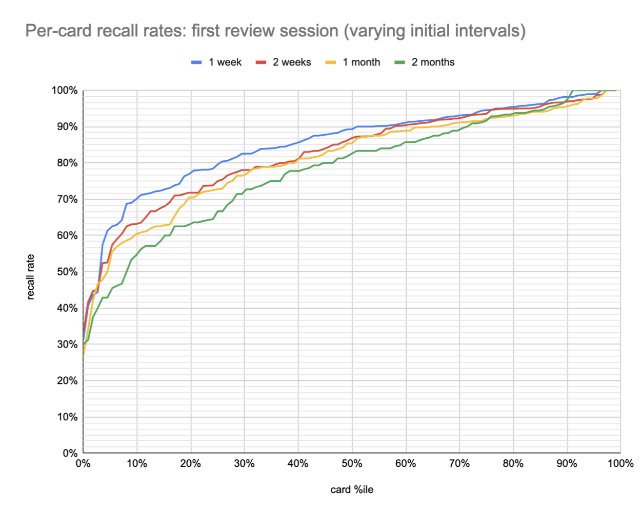
The main thing to notice in the above plot is that the “easiest” ~40% of cards (on the right side) have quite similar recall rates across intervals (at least to 1 month). After that, the curves spread apart, first slightly and then dramatically, before coming back together around the 5th %ile.
The average forgetting delta between 1 week and 2 months is only 7pp. But some questions experience much more forgetting. About a third of the questions exhibit substantial forgetting (15 pp); a third exhibit very little (2-3pp); and a third exhibit moderate forgetting (8pp).
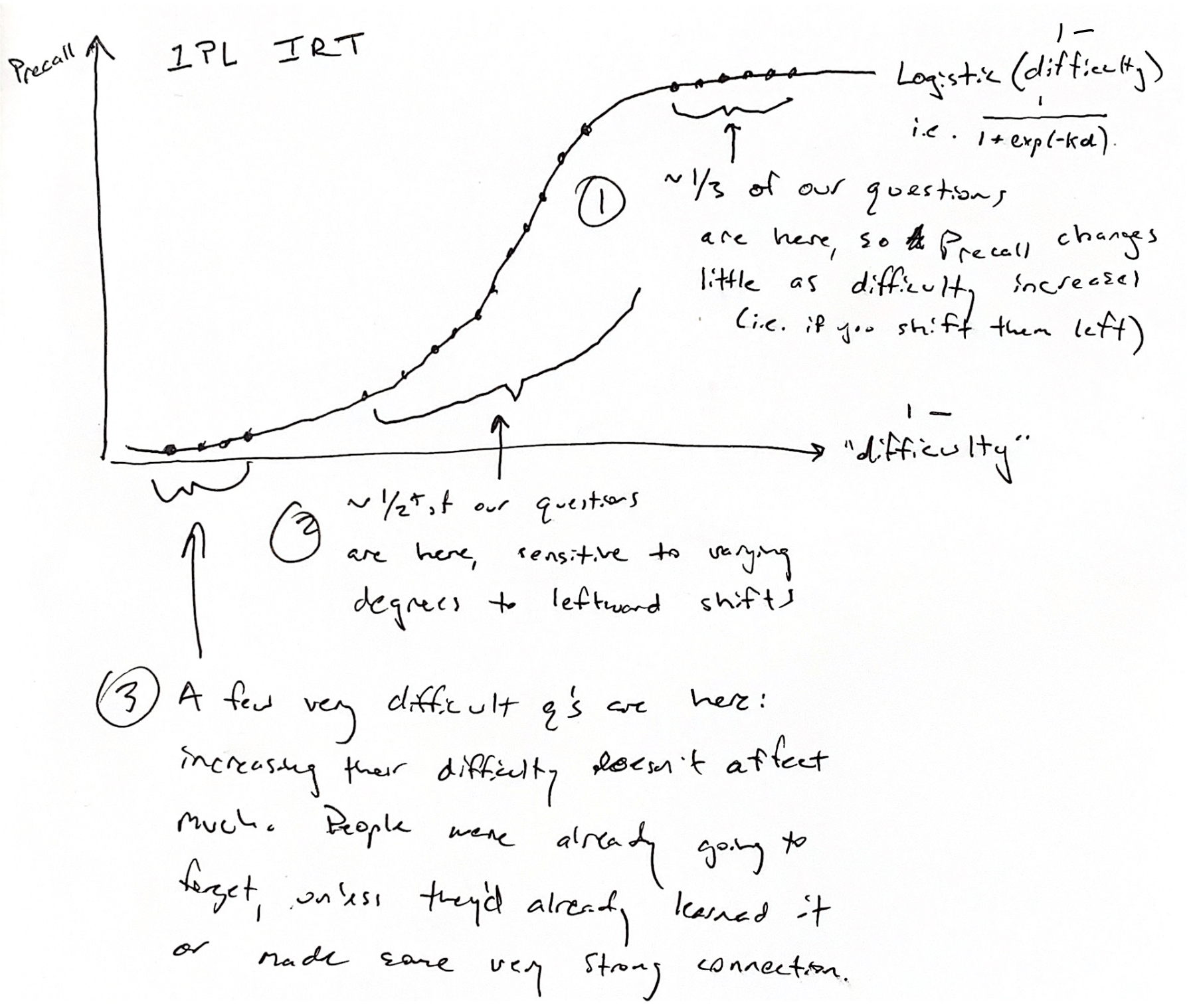
This general shape—insensitivity at low/high %iles, shifts in difficulty in between—is consistent with what we’d expect if recall rates were predicted by item response theory:
All this is broadly consistent with other findings which show a great deal of per-question variability, as well as a large proportion of “easy” questions:
- Withheld Quantum Country questions have highly variable accuracy rates (2020 efficacy study)
- Half of all long-term Quantum Country lapses come from just 12% of its questions
- 2021-03-25 Patreon update - Too easy to be effortless
Make-up sessions
This appears to be less true of initial “make-up” sessions—i.e. those scheduled for questions forgotten in-essay.
See qc-analysis.Rmd 20220223115524.
An average of 9pp penalty across the board.
Extending with comparison to 2019 users
When QC launched, the initial interval was just one day. It’s a different cohort of users—no longer randomly assigned to schedules—but it’s interesting to add that data to the plot (20220117114610):
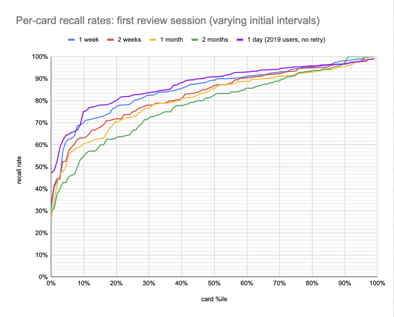
This data continues the pattern we’d seen above. The comparison isn’t quite fair because these 2019 users didn’t have the retry mechanism, and we’ve found that that may have a larger impact than forgetting: Retry intervention produces substantial increases in early accuracy on Quantum Country. But the samples above (for all lines) skip initial “make-up” review sessions where the prompt has not yet been successfully recalled, which accounts for at least some of the retry effect.
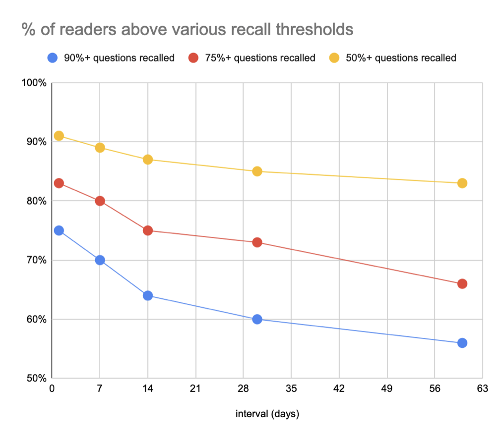
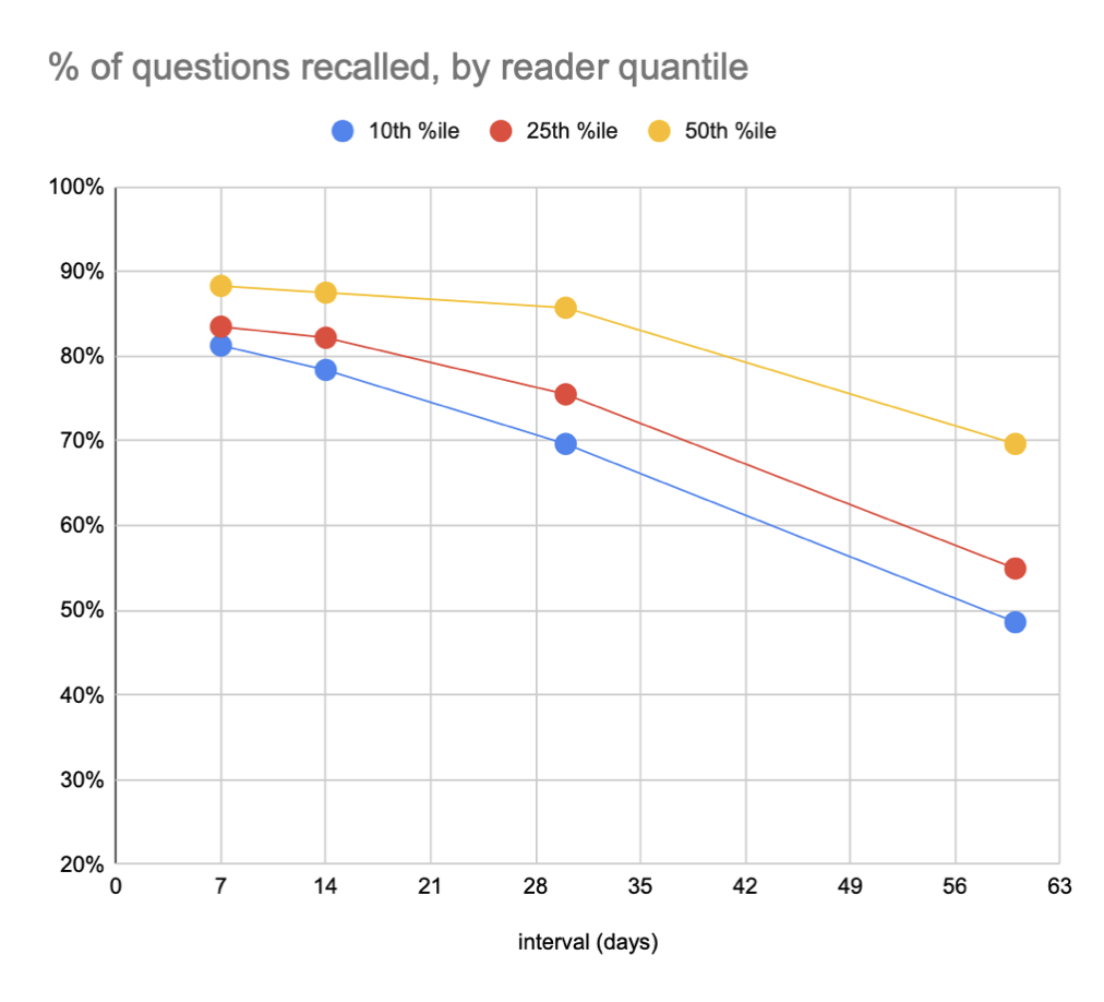
Extending our summary statistics: say that our aim is a recall rate of 90%. At one day, 75% of readers will recall 90%+ of questions. At one week, that falls to 70%; at two weeks, that falls to 64%; at 1 month, 60%; at 2 months, 56%.
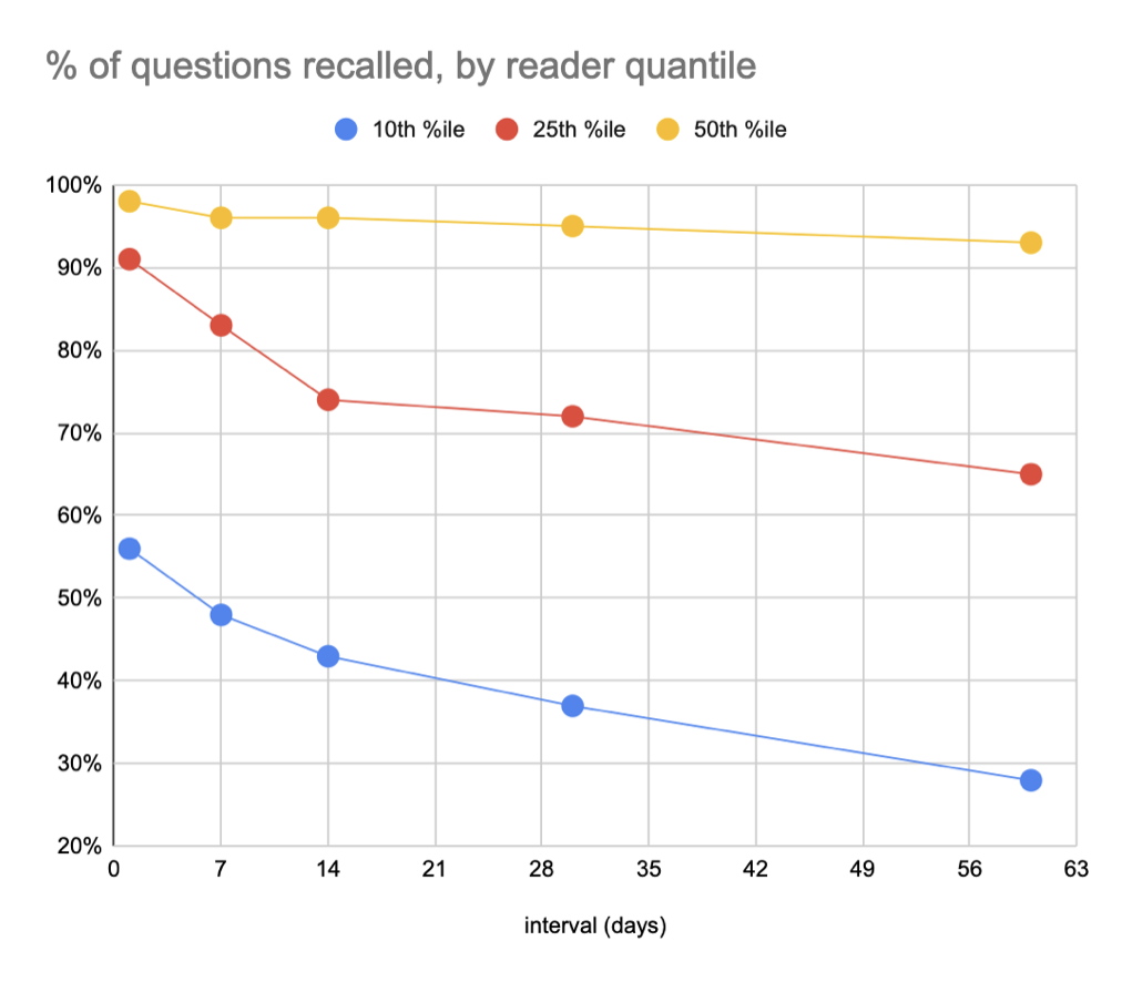
Slicing this another way, we could ask what the recall rate is for the 25th %ile reader across these intervals. At one day, it’s ~91%; at one week, it’s ~83%; at two weeks, it’s ~74%; at one month it’s ~72%; at two months it’s ~65%.
These figures aren’t quite legitimate because they include (many) readers who didn’t actually complete a full first review, but they’re a reasonable first-order approximation.
For me, one surprise in this plot series is just how skewed the reader distribution seems to be. The median user barely forgets. It’s the bottom half of users who are dragging down the totals.
Here’s a version of these plots including only users who complete a full first review—not many samples, but perhaps a truer picture… though of course this one has a lot of selection bias.
20220120173038 chart
 20220120172508
==TODO these figures probably want to be extracted to their own pages==
Relative analysis
We can see this effect a bit more clearly in relative form. Here’s each plot divided by the 1 week line to show marginal forgetting (same x axis as above):
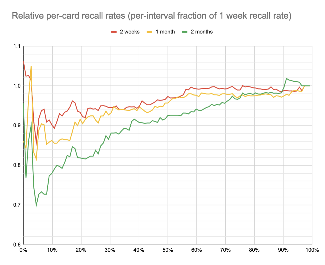
Recall rates for 2 weeks and 1 month are above 98% those of 1 week until around the 60th %ile, then they drop to 90% and 86% before recovering for the hardest few cards. 2 months follows a similar curve but begins its decline earlier, at around the 80th %ile, and falls to a low of 70%.
Here’s a prose interpretation:
Increasing the initial review interval from 1 week to 1 month drops recall rates an additional 5-15% for ~5th-50th %ile cards, and has relatively little effect on the rest.
Increasing the initial review interval from 1 week to 2 months drops recall rates an additional 5-30% for ~5th-75th %ile cards, and has a relatively small effect on the rest.
(Note that in the above figure, each condition’s cards are sorted low-to-high independently, so a given x position does not necessarily correspond to the same card. There’s a fair amount of noise in these relatively small samples, but their order is “eyeball” similar. Haven’t yet done any ordinal statistical tests to confirm that; I suppose I could.)
Model interpretation
I mentioned earlier that what we’re seeing is roughly what we’d expect to see given IRT, if many items are easy so that they’re spread onto the right “leg” of the logistic.
This isn’t rigorous at all, but just to get a sense for the plausibility of the explanation above, I made a simple IRT model which produces plots similar to those above, assuming a stupid simple two-level difficulty model (i.e. “there are a few quite hard questions; almost all the rest are pretty easy”).
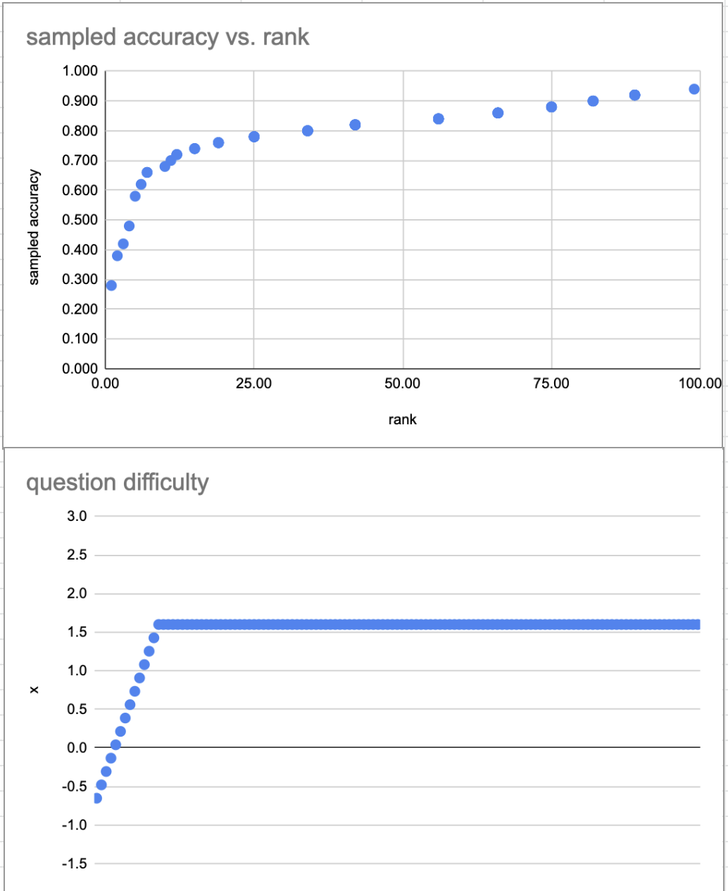
The slow upwards curve (seen in both these model plots and in the model plot above) doesn’t necessarily imply that question “difficulty” slowly slopes upwards. It can be explained by sampling noise: we’re drawing ~50 samples from a binomial; at these p values, the 95% CI is ~7% wide.