Andyʼs working notes
About these notes2021-09-30 Patreon letter - Architectures for a more flexible mnemonic medium
Private copy; not to be shared publicly; part of Patron letters on memory system experiments
I thought I’d try something different for this month’s update—sharing some rough in-progress design work. The tension here is that it takes a huge amount of work to legibly present a design process to others, especially when large swaths of it are unresolved. Good storytelling requires lots of renderings you wouldn’t otherwise have made. Designers who work for agencies or on very large teams at product companies are used to paying this heavy tax, but it doesn’t make sense for me working solo. Thankfully, you all have a great deal of context, so I hope you’ll bear with me and bring your imaginations. That said, though much of this discussion is conceptual, it will rely on actual pictures of interfaces, and so there’s no audio version of this post.
Last month I introduced a key design problem with the mnemonic medium: it puts the author in the driver’s seat, assuming you want to read—and memorize!—linearly and completely. This is appropriate in some situations, but in many contexts readers will (appropriately) want to drive, reading selectively and strategically.
I’ve been rethinking the primitives of the medium to make this possible. The goal is to avoid making several different “modes” of the medium, but rather to identify some elemental representations which can be recombined in different ways in different situations, by both author and reader. When you find the right abstractions, it feels a bit like carving “with the grain” of the universe—more like discovering something that already is than creating something new. VisiCalc cells have that energy; so do files and folders; so do Beziér curves and their corresponding pen tools; Photoshop layers; etc.
Reading scenarios and behavioral axes
Finding such a primitive usually means identifying some pattern common to many kinds of activities. So I’ve been analyzing a variety of reading situations, trying to perceive some shared structure in the differences.
Four scenarios have emerged as useful anchors. These aren’t collectively exhaustive, of course, but they span a large space and illustrate some of the problem’s texture:
- Reading a guided primer to gain one’s footing in an unfamiliar subject of significant personal interest. Quantum Country is a good example if your interests align.
- Extracting pearls from important publications relevant to a creative project or interest. For instance, if you’re a machine learning researcher, you probably studied the GPT-3 paper with careful interest.
- Consulting a reference, almanac, or handbook for information on a specific question. This would include Wikipedia and many articles on Our World in Data. But it might also include handbooks like “The Great CEO Within”, which is structured to be read piecemeal in response to your situation’s needs.
- Reading for edification. New Yorker articles; reflective blog posts; general-audience non-fiction like Sapiens or Thinking, Fast and Slow (assuming those topics aren’t a creative focus for you). These are usually read with a light touch, in large part for enjoyment.
Should the mnemonic medium target all these different situations? It’s not clear to me. The benefit is much more obvious for primers, for instance, than for edification reading. Practically speaking, it would be easiest to focus on “linchpin” texts with a large number of readers who have consistent interests. But one principle I’ve learned in design is that while the 80/20 principle is useful, it’s often quite valuable to design for a much larger scope than you intend to immediately implement. The latter approach can help you find more general primitives, primitives which you can “grow into”. 80/20-ing often produces architectures which will make future expansion difficult. Worse—once implemented, limited architectures sometimes constrain how you can think about pursuing future expansion. The trick, of course, is to figure out exactly where to place the bounds on your problem. The design problem becomes much more difficult as you expand the scope, and often much less connected to the pressures of some authentic situation in which you’ll be prototyping. Should I try to produce a design architecture which incorporates future machine-learning-based prompt generation interactions? Which integrates fully with the rest of one’s personal knowledge management system? For the moment, I choose to answer “no”, but I’ll try to handle a large range of different reading contexts. These are all scenarios for which I feel expert-authored spaced repetition prompts could be tremendously useful.
One important axis of variation in these scenarios is completeness. If you’re reading a guided primer or studying an important publication, you may want to remember all the key details. But if you’re consulting a reference like Wikipedia, you’re probably reading quite non-linearly, focusing only on a few sections of the text—and the memory system should behave accordingly. Likewise, you’re usually less interested in completeness when reading for edification: you may read the whole essay front to back, but you mostly just care about a few high-level “take-aways”. Note that these latter two situations differ in the nature of their incompleteness: reference readers will want a memory system which supports selectivity and non-linearity, while edification readers will want a memory system which supports higher granularity and a lower level of detail.
Another important axis of variation is legibility of reader intent. A primer positions itself as an explicitly instructional resource, so authors can assume that readers really do want to learn the material. It’s reasonable for the text to pause intermittently and challenge you to remember key details. But in most of these other situations, embedded review activities can feel misaligned with reader intent. We hear this clearly, for instance, in reader feedback to David Chapman’s mnemonic essay, “Maps, the territory, and meta-rationality” . You’re reading for edification, and then—bam—an interface element appears demanding that you remember some fine detail of the argument. As one reader noted, it “feels like school”: the demand is out of proportion with your level of commitment. In many situations, embedded review will seem pompous or presumptuous, as if the author’s proclaiming that readers must hang on their every word. The trouble here is that some readers of Chapman’s essay approach it as it if were an explicitly instructional resource. For these readers, the embedded reviews are a boon, but the author can’t know ahead of time which reader is which. The medium must permit self-selection without feelings of imposition.
A final axis I’d like to introduce: readers’ propensity to write their own prompts. Say you’re reading an important paper related to a creative project. You may want to remember all the key details the author describes, but the most important prompts may be about that paper’s implications for your own ideas. Likewise, if you’re reading an essay about relationships, you may find yourself wanting to write a prompt or two connecting it to your own life. But when reading a reference you’re typically just grabbing what’s there; when reading a primer, you generally don’t know the topic well enough to draw many connections of your own.
So we’d like to identify primitives for the mnemonic medium which can be used in different ways—by both readers and authors—to address different positions on these axes.
Workflows and primitive desiderata
One way to think about this is to consider typical workflows for different positions:
- when completeness is high, “add all prompts in section/page” is the common-case interaction… but those prompts may get refined iteratively in future review sessions
- when completeness is low, the medium should offer lightweight paths for opting into prompts about personally relevant details…
- … either through outlets for spontaneous impulses of interest, in the moment while reading,
- … or by retrospectively deciding in bulk what details seemed important at a suitable stopping point
- when readers legibly intend to study, it’s welcome for the medium to intermittently prompt them to recall what they’ve read
- when reader intent is not legible, the medium must not alienate readers by pressuring them to review
- when readers are likely to write their own prompts, I see two workflows of interest:
- when a reader suddenly notices a connection they want to remember in the middle of a passage, they should be able to immediately capture it
- in my own practice, I find it natural to reflect on “so what?” at the end of a piece (or, for longer pieces, at section breaks), and to write prompts on my observations
- when readers are unlikely to make personal connections, affordances for prompt-writing should not impede the workflow for collecting authored prompts
This list of workflows suggests three significant presentation contexts for prompts, in addition to the existing review context:
- bulk sets of prompts presented retrospectively at section breaks or the end of a piece
- inline contextual interactions for responding to in-the-moment impulses while reading (“ooh, let’s make sure we remember that!”)
- iterative refinement during/after/between review sessions, in the context of the Orbit app rather than in the context of an author’s web page
Readers may fluidly move between these contexts, so we don’t want to create artificial boundaries. We’d ideally like some elemental primitive which can represent a prompt across many contexts—much as a Tweet feels like an elemental object equally at home embedded in isolation, displayed in a list, or partially constructed in a composer interface. The detailed affordances might differ in each of those contexts, but the form of a Tweet holds solid and feels like the “same thing” across those different environments.
Because some low-completeness workflows will involve readers quickly scanning and choosing from a list of potential prompts, it’s important that prompts can be displayed in a compact representation. This will likewise help in machine learning-driven contexts, where we probably can’t reliably generate exactly the prompt you want, but we may succeed often enough if we can generate ten prompts and let you choose.
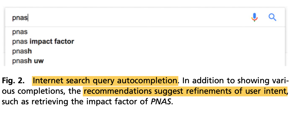
In his 2019 paper “Agency plus automation,” Jeffrey Heer identifies an important pattern for designing artificial intelligence into interactive interfaces: shared representations which can be created by either human or machine. This allows the machine to suggest possible domain actions which can be fluidly adapted/adopted by the user, and for the user’s actions to be understood in the same terms by the ML system. Google’s search result suggestions (as seen below, excerpted from Heer's paper) are a good simple example. This principle may apply directly if we pursue ML-based prompt generation in the future, but even in the present, it applies well to the problem of co-mingling author and reader prompts. Author prompts should be the same “kind of thing" as reader prompts. Readers should be able to co-opt and alter author prompts with minimal ceremony, just as they do with Google search results suggestions.
There’s a related cluster of desiderata for a list representation, which I’ll summarize as fluidity. Given a list of potential prompts (either by author or by ML model), readers should be able to quickly choose the ones they want and make any necessary edits. If a reader discovers while writing a prompt that it actually wants to be two prompts, this shouldn’t involve moving through multiple “screens” or “modes.” Prompts are like sentences, and they’re often edited holistically; when writing or editing a prompt, I should always maintain “peripheral vision” of its “neighbors”, just like editing a sentence in a paragraph in a text editor.
For the last two years I’ve been writing prompts in plaintext files in a text editor, and I’ve come to really value the flexibility that comes with seeing and editing multiple prompts fluidly and simultaneously.1 I’d like to bring this fluidity to embedded reading contexts, but with more structure than my freeform text files. I’ve been particularly inspired by to-do list apps, which often feature the fluidity of a continuous textual canvas. Apple’s Reminders does roughly what I have in mind:
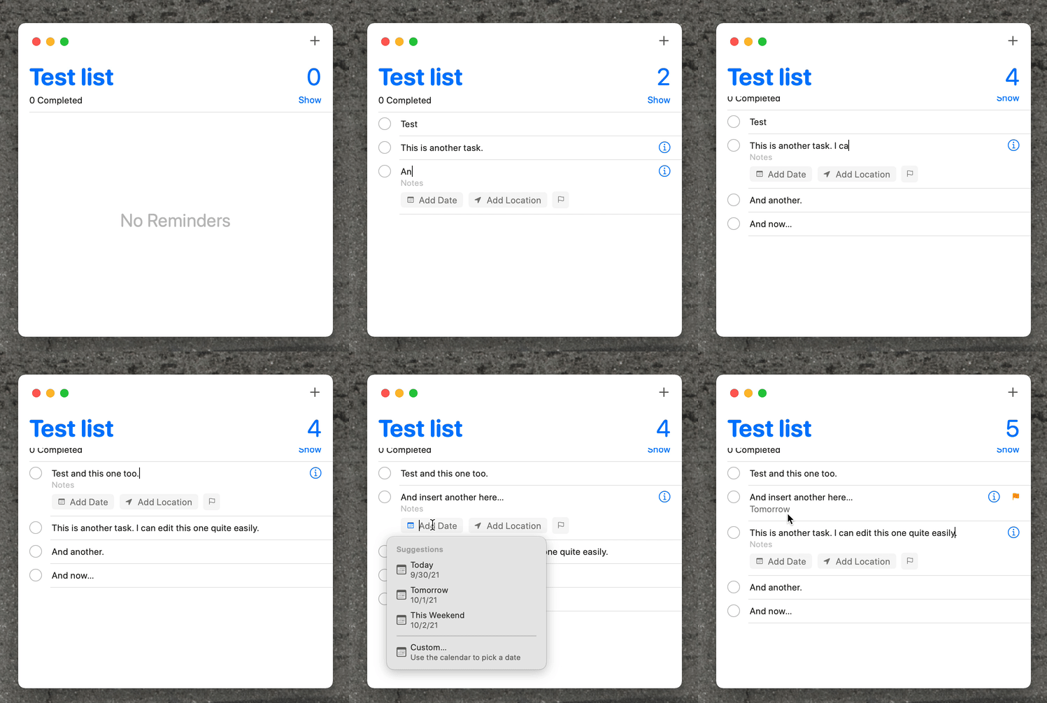
A related benefit of the continuous textual canvas metaphor is that it suggests a malleable interchange format. You should be able to select many prompts and copy them—they’re just Markdown, perhaps with some extra markup. So you can paste them into Twitter, or into a PDF annotation, or into a source file’s comment section, or whatever. And you can likewise copy plaintext prompts from such places and paste them into Orbit. Complex prompt “generators” can be implemented as macros in your editor of choice. I think such malleability may lead to surprising user behaviors.
Even though it’s often not appropriate to impose tests on readers, section breaks remain an important place for embedded interactions, particularly in long pieces. Assuming the author’s doing their job, the section already represents a somewhat cohesive cluster of material. By anchoring an interaction at the end of the section, we can lighten the burden of evaluating and indicating relevant prompts: in many cases, the sections will naturally reflect boundaries of reader interest. Readers who were keenly interested in the section may “add all” then remove a few less interesting prompts; readers who mostly skimmed through the section may skip the associated prompts, or skim them and add one or two.
Separately, Quantum Country readers reported a few interesting implications of embedded interactions at section breaks. Those review sessions provide a sense of safety: if you’re feeling unsteady while reading, you can take some comfort in knowing that a review will soon reassure you that you understood what you were meant to—and if not, that you’ll get some feedback on what needs more attention. For some readers, the embedded reviews create a visceral sense of “progress” while reading: the reviews help them feel their progress in understanding the topic. For other readers, the embedded reviews help them regulate their reading: “I finished this section and thought I understood—but answering these questions, I found I had absorbed absolutely none of it! So I went back and re-read more carefully.” Of course, these effects are double-edged. They’re helpful if your stance towards the text is explicitly one of a diligent student; they’re representative of the medium’s inappropriate imposition when you’re reading more casually or tactically.
Solution sketches
I’ve been exploring the space of representations which might satisfy all those properties. It’s always an iterative process, and what I’ll show here is certainly interim work.
First, we should do no harm to the primer scenario. For texts like Quantum Country, we’d still like the “default” reading behavior to involve the interleaved review breaks, and to result in “saving” all the prompts encountered. But in the context of these defaults, we’d still like to offer more control. If a question doesn’t seem meaningful, you shouldn’t be studying it. If you’d like to reword a question, you should be able to do so. If you’d like to add a prompt of your own, you should have that ability.
My approach here is:
- primers and other explicitly instructional media can embed interleaved review areas which initially behave much as they do today
- but during the review, readers can incrementally assert control as they feel so inspired:
- they can skip a prompt they find uninteresting
- they can edit a prompt whose wording they find unappealing
- they can write a prompt of their own if they feel so inspired
- they can switch directly to a list view, which I’ll describe in a moment
- prompts the reader reviews (but not those they skip) are automatically added to their account; prompts they skip are not
- when they finish the review set, they’re presented with a birds-eye list of the prompts, where they can:
- undo the automatic behavior of adding the prompts they reviewed
- selectively add/remove individual prompts
- edit and add new prompts as they like
The practical upshot: readers get the current default behavior with zero additional interactions, but they have a smooth gradient of opportunities to modify that behavior before, during, and after the review.
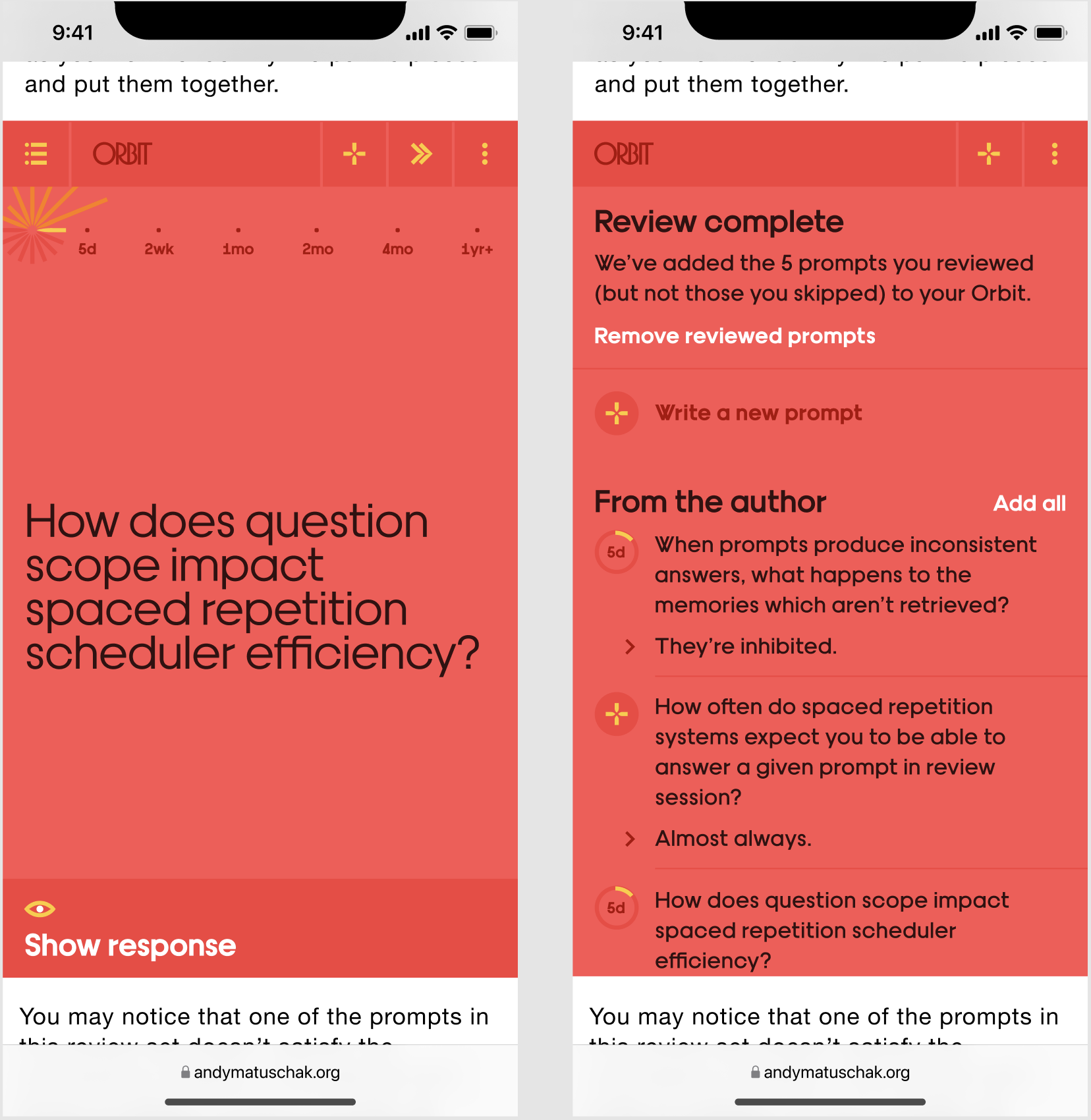
You’ll notice that the latter screenshot demonstrates a list-style interface. The idea is that it’s a continuous textual canvas, like the Apple Reminders interface above. And so writing new prompts is an inline experience, not a modal one:
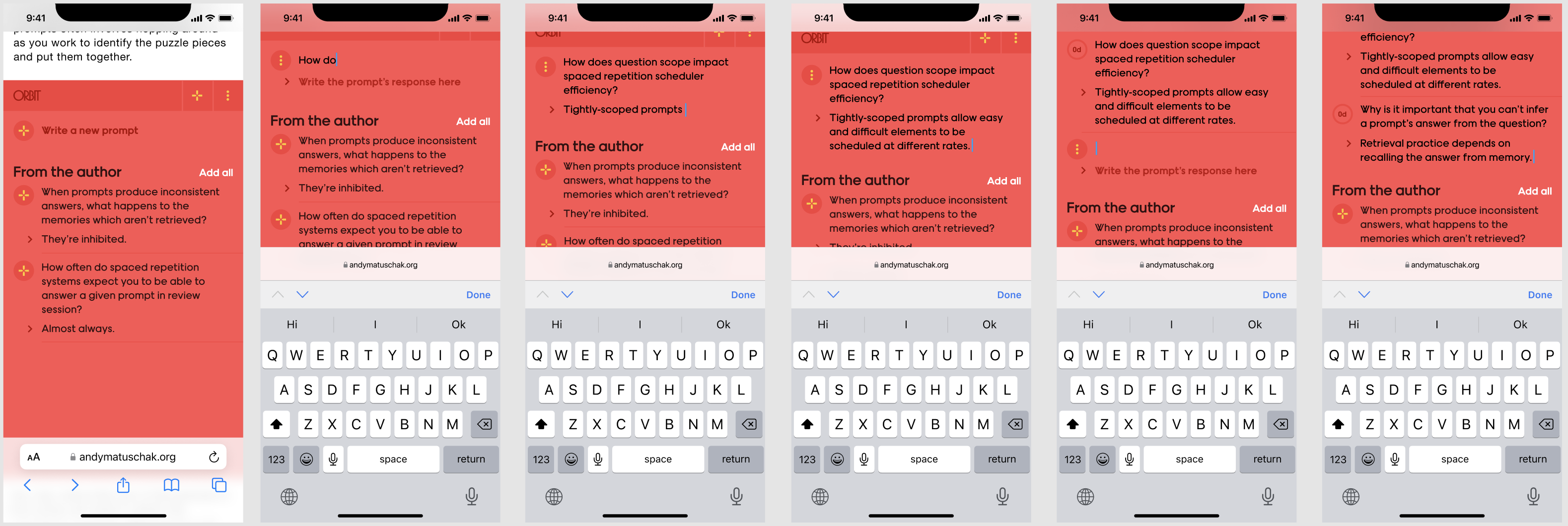
The same list representation can be naturally repurposed in the Orbit app as a “library” view, for iteratively refining prompts over time or writing new ones.
The workflow I’ve depicted above makes sense for primers and other contexts in which readers legibly intend to study. In most other scenarios, it’s inappropriately pushy, but the same embedded element may work well in many contexts if we simply invert it—that is, if it defaults to displaying the list view, rather than the review experience. With that change, the element’s emotional posture shifts substantially: it becomes a resource at the reader’s disposal, rather than the demand of an insensitive instructor. If the reader does intend to carefully study the material, they can start a review from the list.
I think this kind of embedded list makes a lot of sense at the end of a blog post, and perhaps interleaved into explanatory material which may have readers of many different interests levels. It still strikes me as a notch too presumptuous for the context of many papers (it’s a large visual element which implies: “my findings are worth memorizing”). And it’s too coarse a workflow for particularly low-completeness reference scenarios, like an Our World in Data article.
For these latter scenarios, I think an inline contextual interaction will be valuable. At a high level, in some situations you want to be able to simply point at things you find important while you’re reading, and trust that you’ll magically internalize those details. Apart from the obvious tractability concerns, there are conceptual issues. Analyzing Quantum Country’s prompts, I found that about one third didn’t correspond exactly to any text range. Instead, they roughly synthesize the material presented in a general vicinity (e.g. “What’s the inverse of the X gate?”). These somewhat higher-level questions are often more conceptual—and often more useful!—than questions which represent some declarative fact verbatim. And so in many cases, you can’t really point to a particular phrase that would naturally correspond to the most useful prompts.
Rather than insisting on precise inline ranges, one interesting approach is to introduce an inline sigil which indicates “prompts are available covering this general vicinity”. General, synthesis-oriented questions might appear in one of these sigils at the end of several paragraphs introducing the concept.
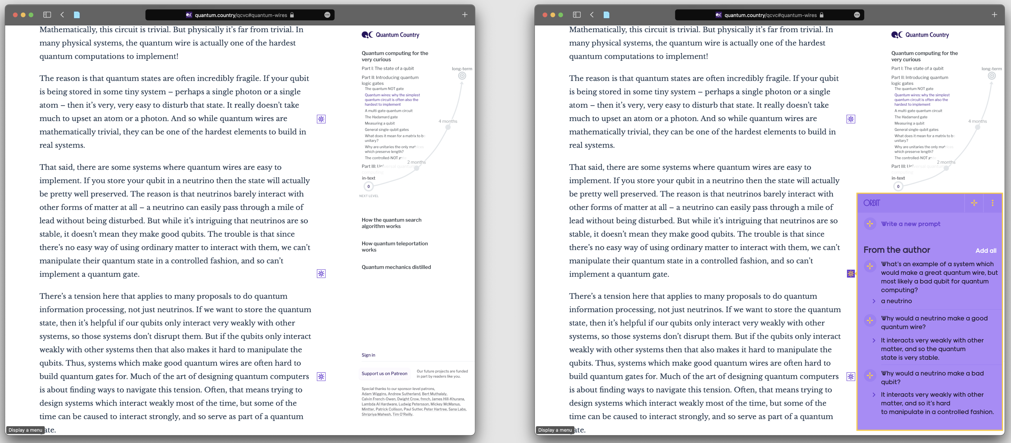
Note the same list representation repeated in the popover behind the sigil.
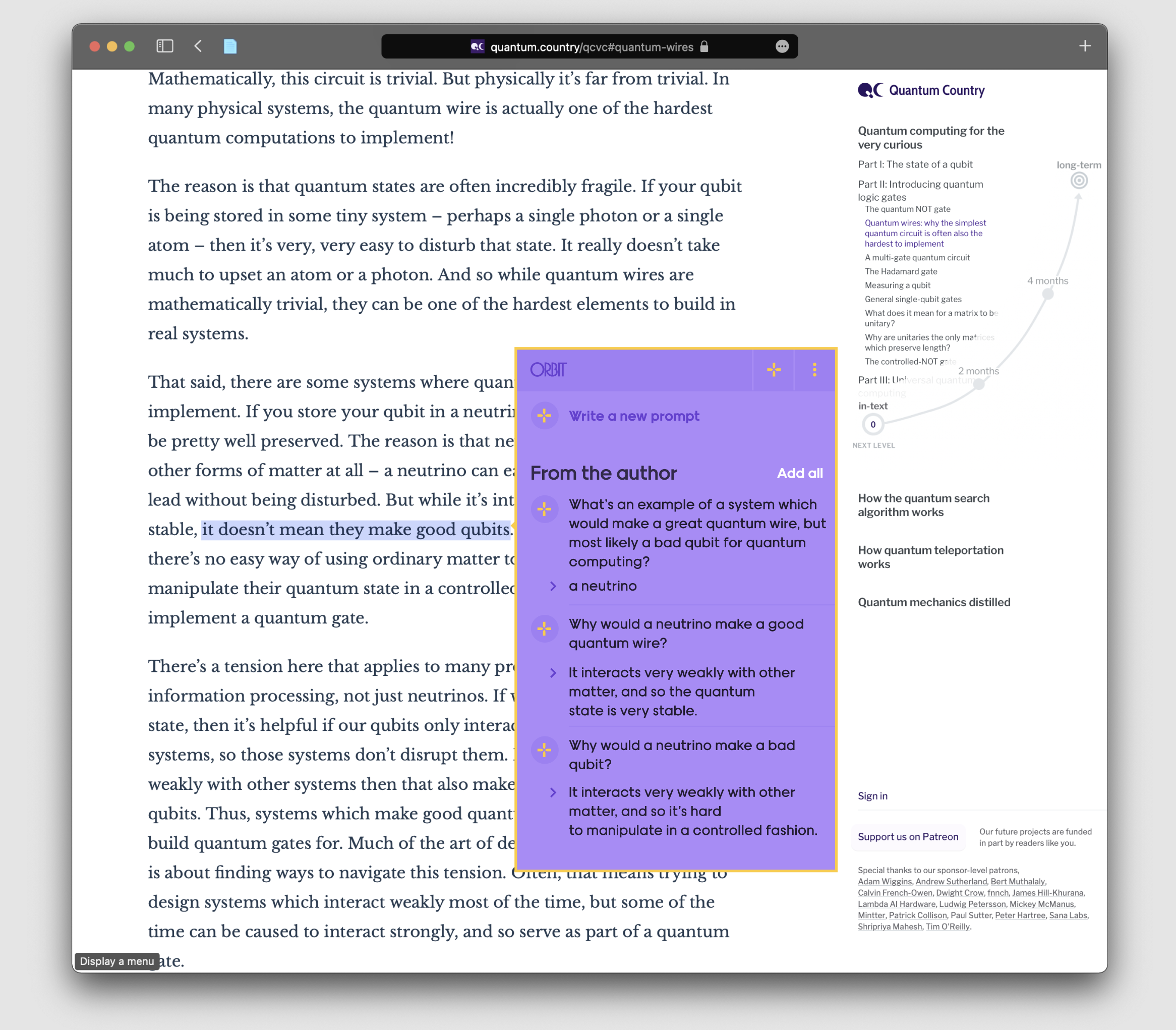
Another somewhat more outlandish approach is to allow readers to select anything at all, and we’ll simply display all prompts associated with that vicinity—and the synthesis-oriented prompts I mention are associated with large text ranges. Readers can pick and choose which make sense.
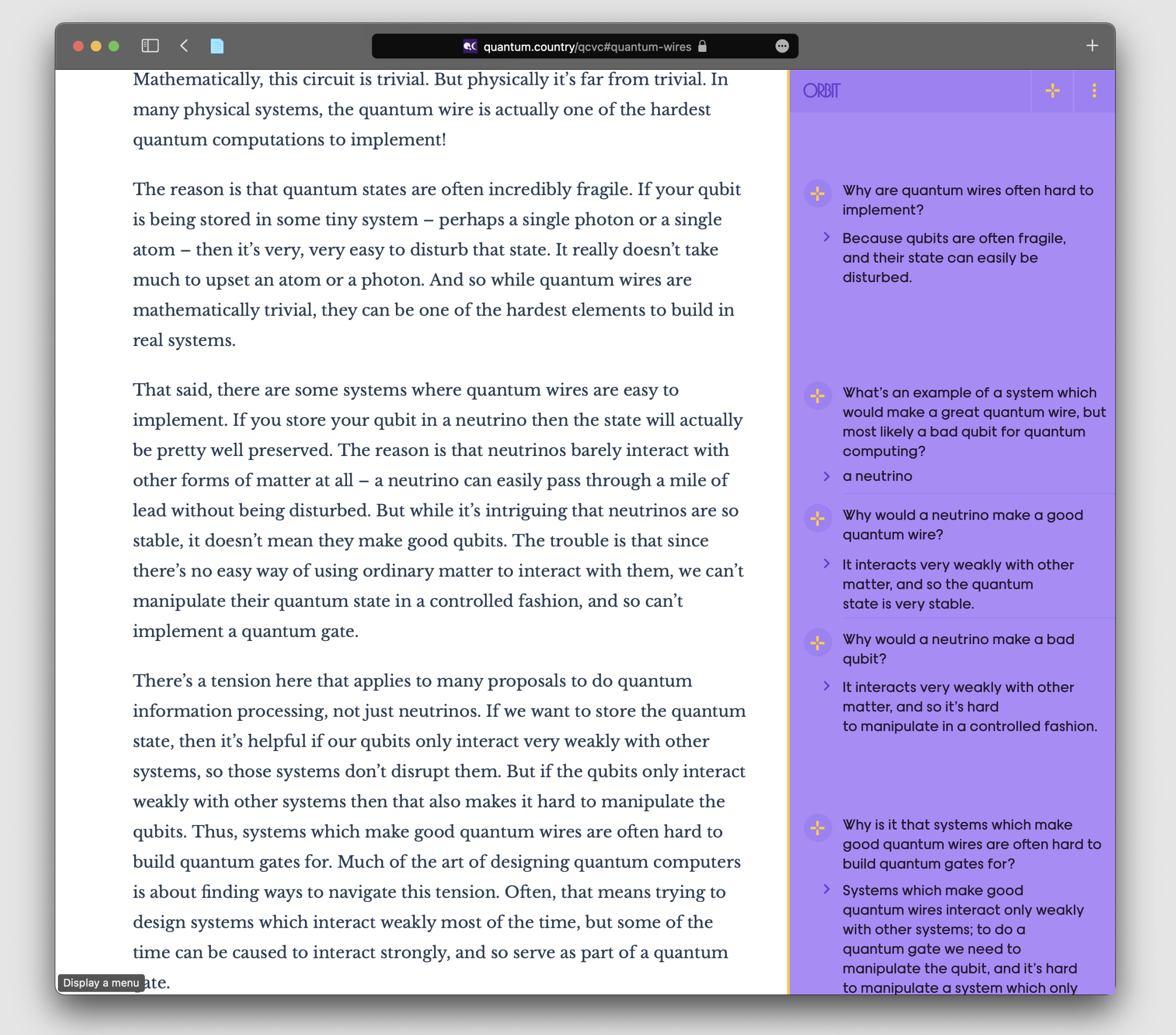
Yet another approach is a persistent sidebar which again recapitulates the list representation, but in a fuzzily-anchored, Google Docs comments-inspired layout. Orbit’s art direction is too overbearing for this kind of persistent presentation.
Irrespective of which path we pursue, it should be possible to write your own contextually-anchored prompts anytime the inspiration strikes you, even if there aren’t any author-provided prompts nearby.
There are a number of challenges in conceptually integrating the embedded blocks with these more inline interactions. In the coming weeks I’ll continue to iterate on these architectures and move into interactive prototypes. More when I have it!
There’s a new systematic review paper about retrieval practice in the classroom (Agarwal et al, 2021). On a whim, I live-streamed writing notes and SRS prompts about this paper. Those interested in my note-writing practices might find that interesting.
I’d like to thank Ozzie Kirkby for prototypes and discussions which contributed to the ideas presented in this post. Thanks also to Nick Barr, Sara LaHue, Marcos Ojeda, Taylor Rogalski for helpful feedback and discussion. Finally, thanks to all of you for the ongoing support which makes this work possible.
1 I should note that RemNote has been pursuing a similar idea commercially. I’ve not used the product in my own work, but I was impressed by their recent redesign, which streamlined a bunch of formality which previously felt overbearing. My primary interest remains prompts in the context of communications media, so I’m very happy to see these folks making progress on prompt-writing environments in the context of personal notes!