Andyʼs working notes
About these notesCross-site interactive embedded widgets
One challenge in developing Orbit has been designing a prompt interface which can be embedded into a wide variety of publications. The design must avoid conflicting radically with the host web page, but it also must clearly relate to this separate “Orbit” place you’ll go to do your reviews. Let’s examine some prior art.
Media widgets
YouTube
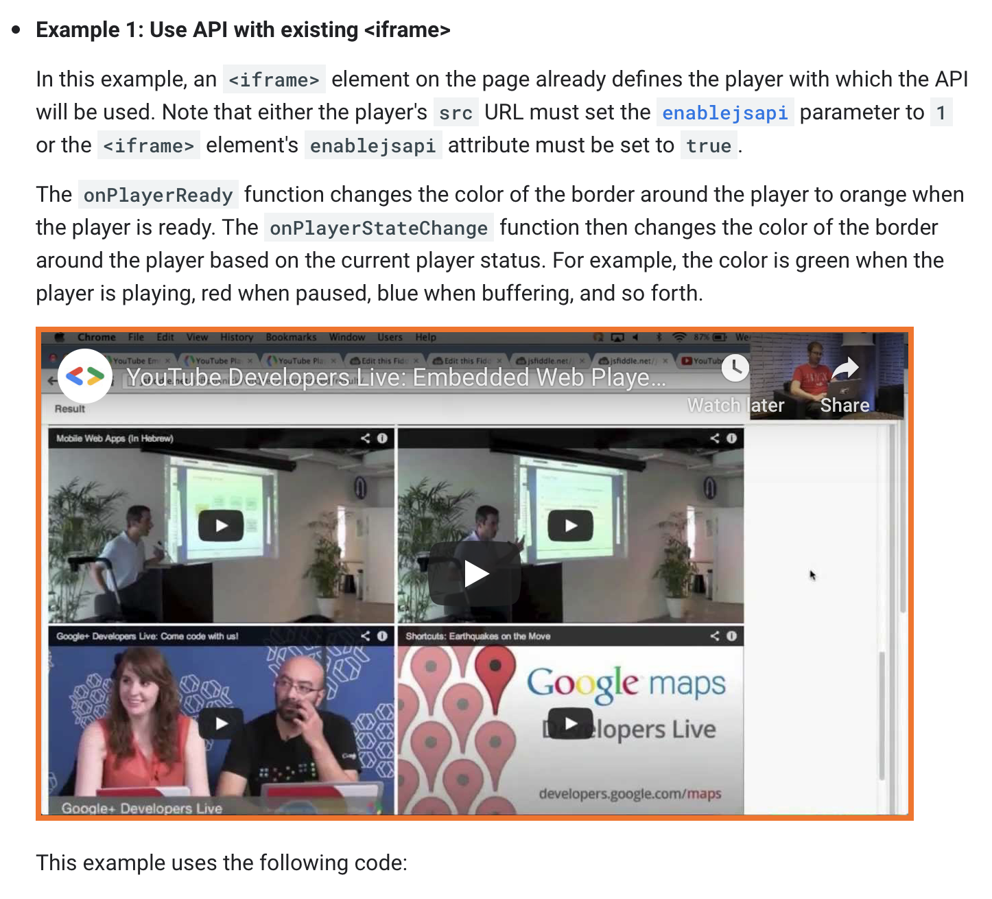
YouTube keeps its interface quite minimal until you interact with it. That helps its integration into the host web page: it “reads” more like an image.
Vimeo
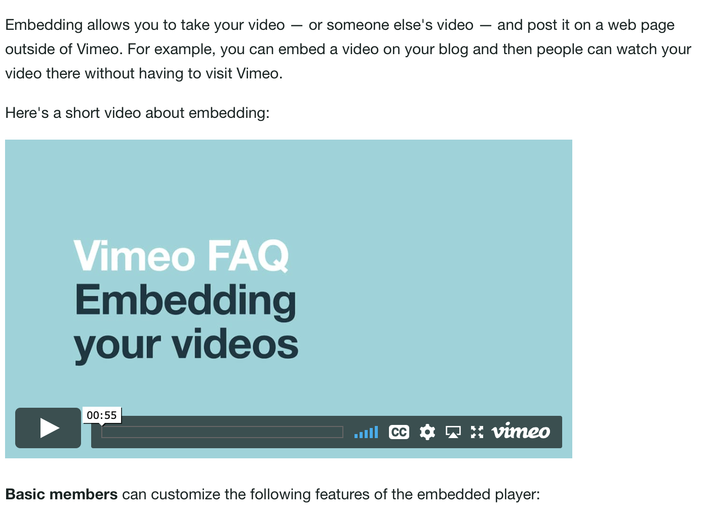
Vimeo keeps text out of its interface, so it doesn’t have to worry about aligning with the host’s text styling. It “reads” as an image with some extra floating administrivia.
SlideShare
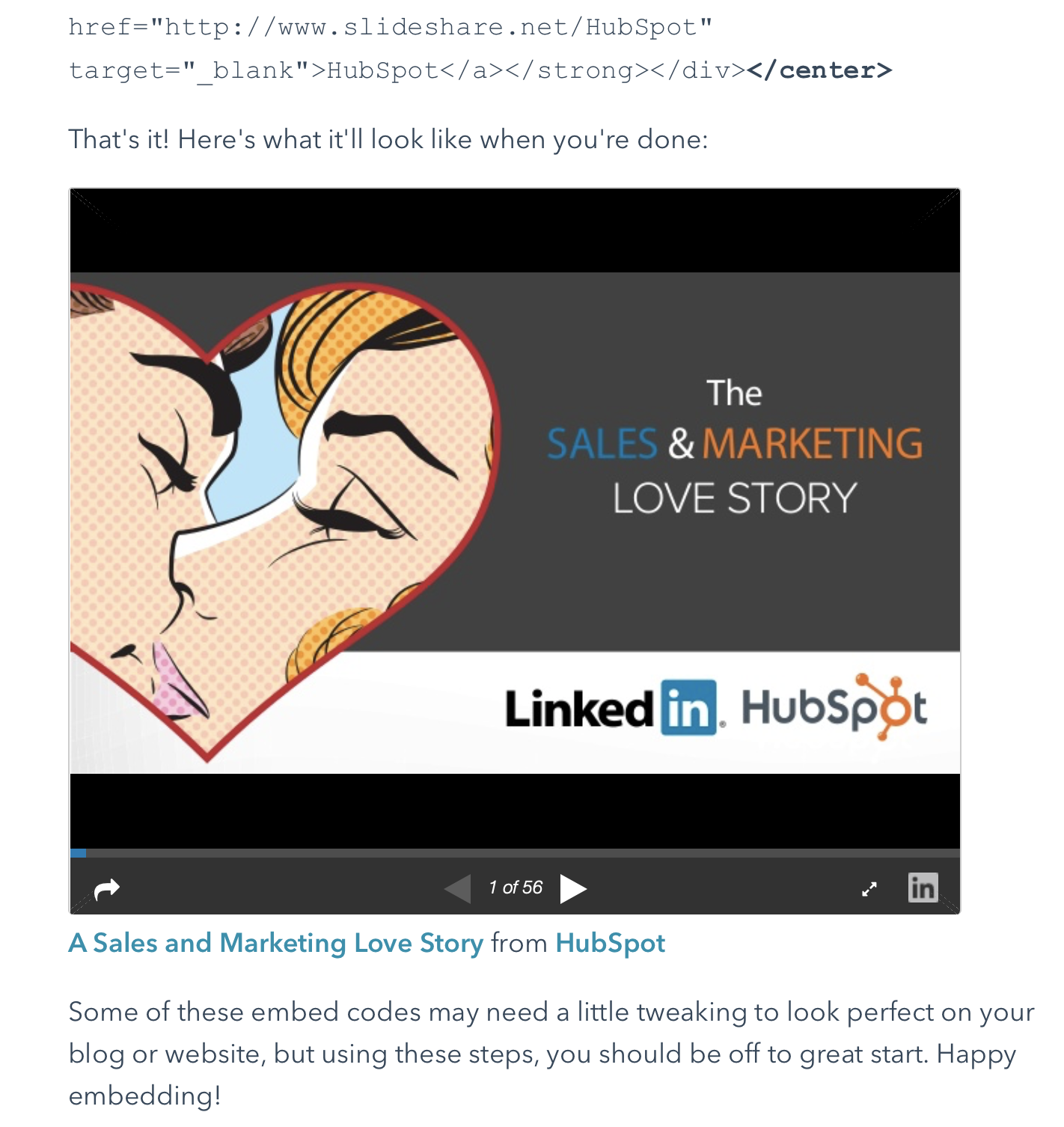
They basically use the design language of videos. It’s not at all trying to blend into the host web page. It’s pretty heavy, feels like a significant departure.
CodePen
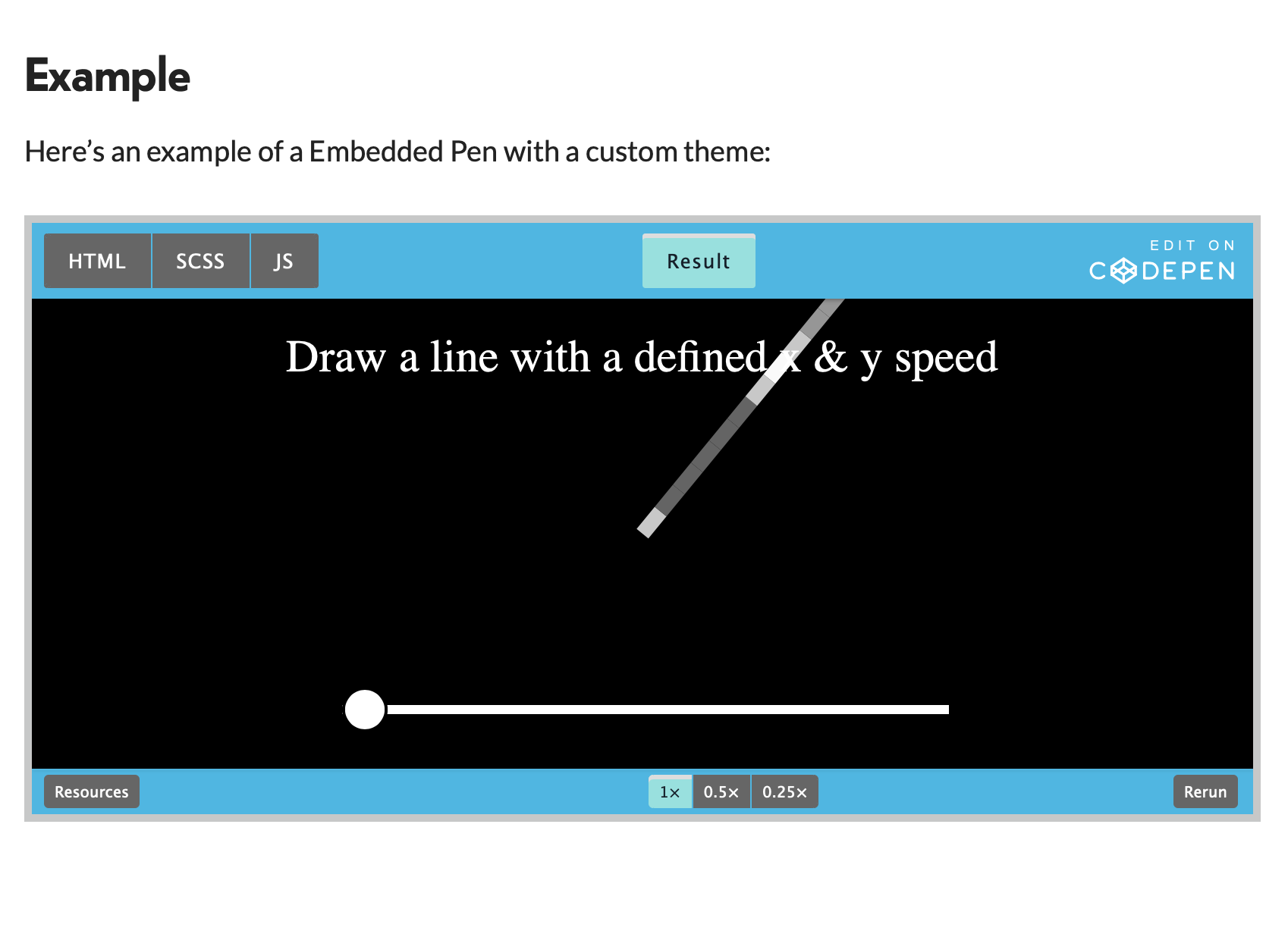
Really looks like a mess!
Social media embeds
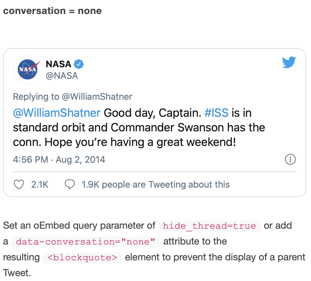
This is a more challenging element to integrate with the host’s styling. A few things help Twitter out here:
- the art direction’s trying hard not to stand out: their use of Helvetica Neue, a typical interface blue, and simple grays all read as “default interface styling.” Web sites which are themselves set in geometric sans serifs may actually look basically identical to the tweet.
- there are no text-labeled buttons, so they don’t need a strong style to distinguish those elements from non-interactive text
- for that matter, there are no important calls-to-action at all, so they don’t bother indicating what’s interactive.
Twitter doesn’t offer any APIs to customize the display (other than for a dark mode). For the most part, they don’t need to. Though it does look a bit off on a web site with a colored background, since its background is white.
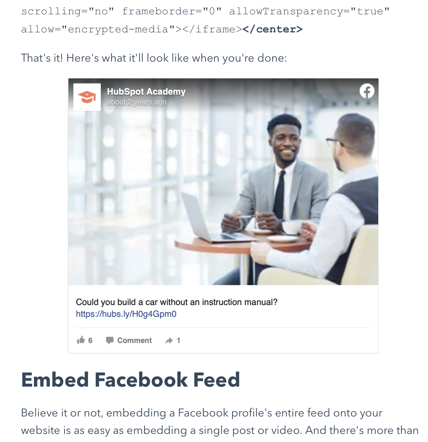
Honestly, this barely reads as Facebook to me. It could be any platform. They use many of the same techniques as Twitter, keeping the platform elements quite subdued and emphasizing the embedded content.
It’s interesting that their interactive elements are grayscale. But they’re not strong calls to action, and it’s obvious what to do. They’re also relying on people having already visited the Facebook web site.
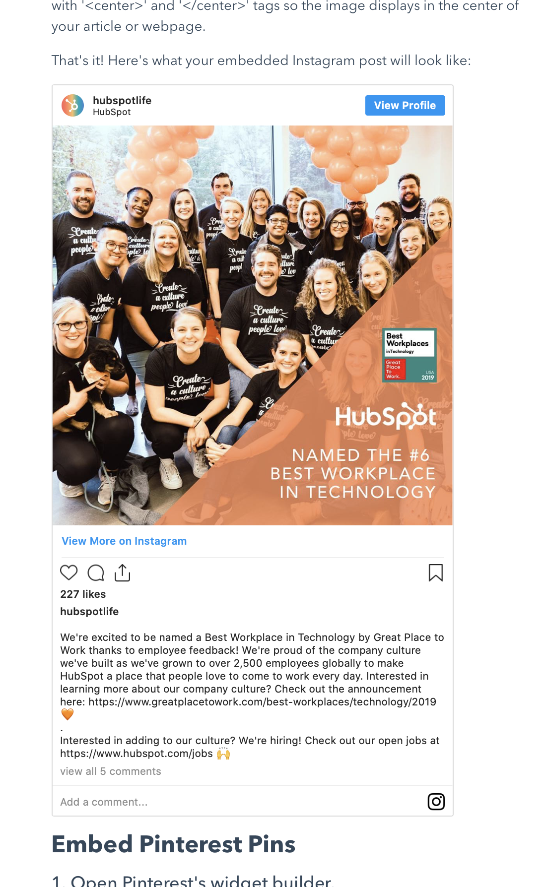
Same as with the others, the art direction is extremely subdued. Very little about this says “Instagram” to me, except insofar as the design echoes what’s in their app. The buttons are monochrome outlines with no particular personality—clearly not important. The only strong call to action is “View Profile,” which is a bit surprising to me: if I embed an Instagram post, do I want to draw so much attention to the profile of the author?