Andyʼs working notes
About these notesBureau Books
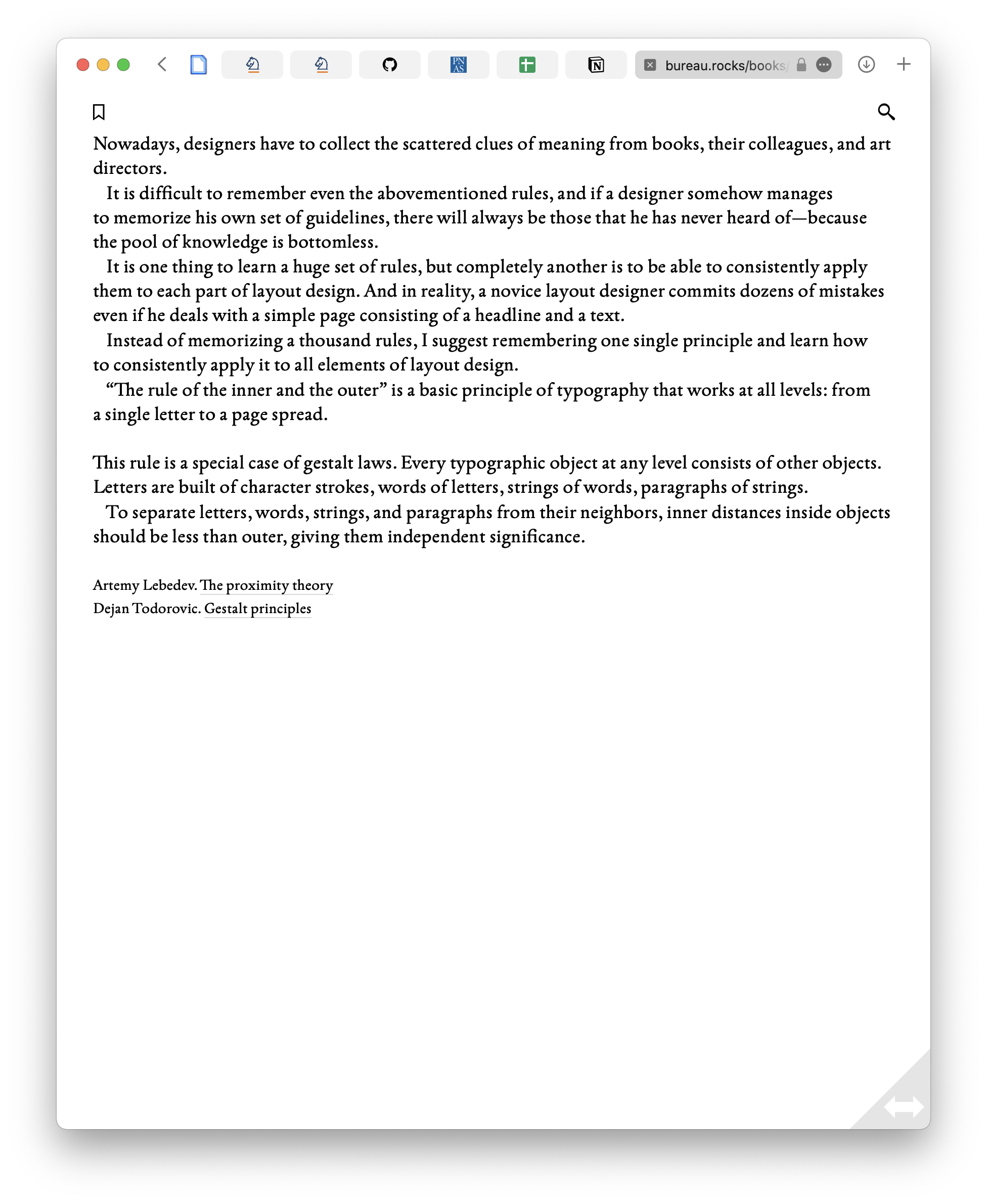
The Russian design agency Bureau is producing some very well-crafted Web books, characterized by custom “spreads” which are partially flexible but which retain fixed layout structures.
Design elements
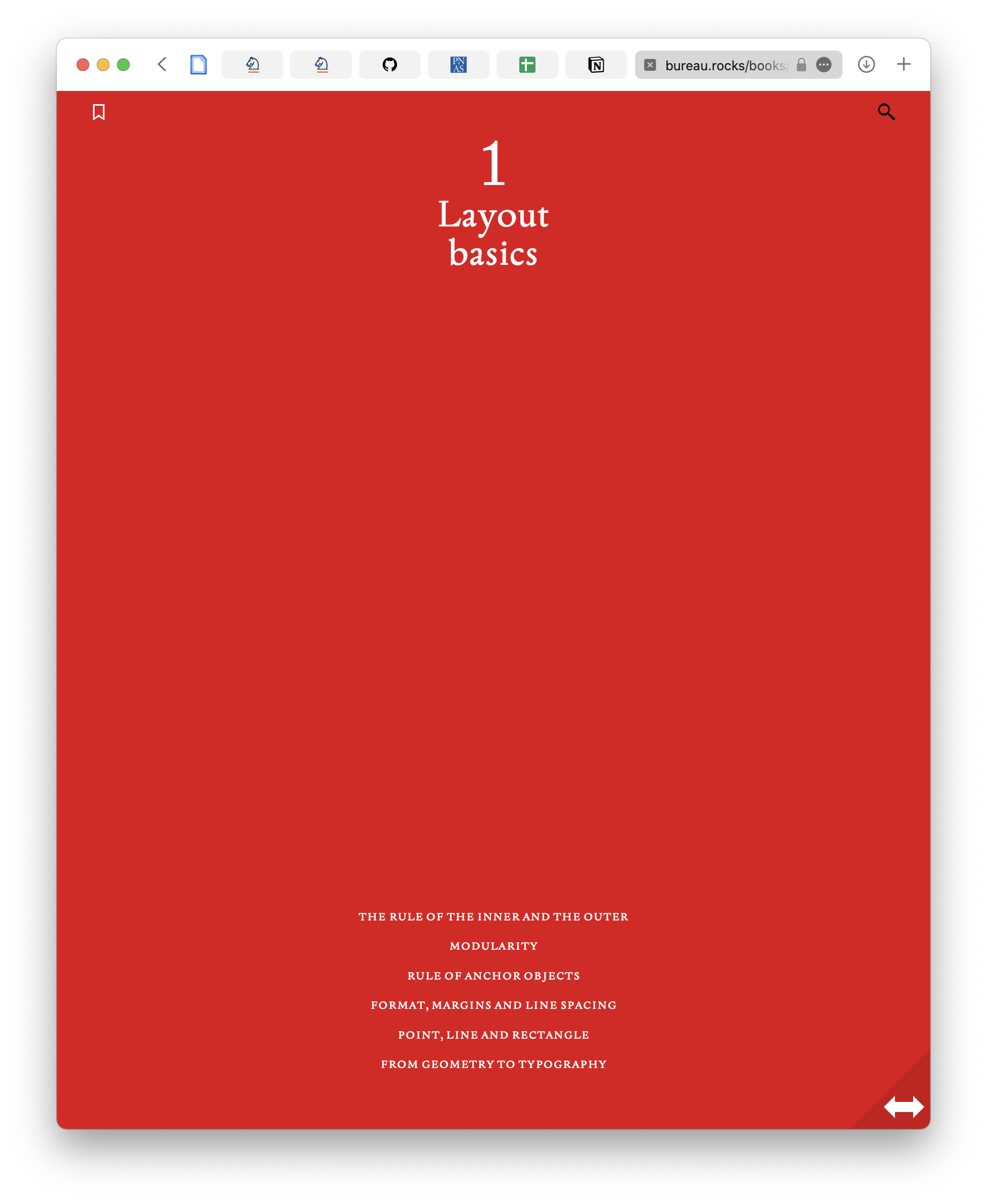
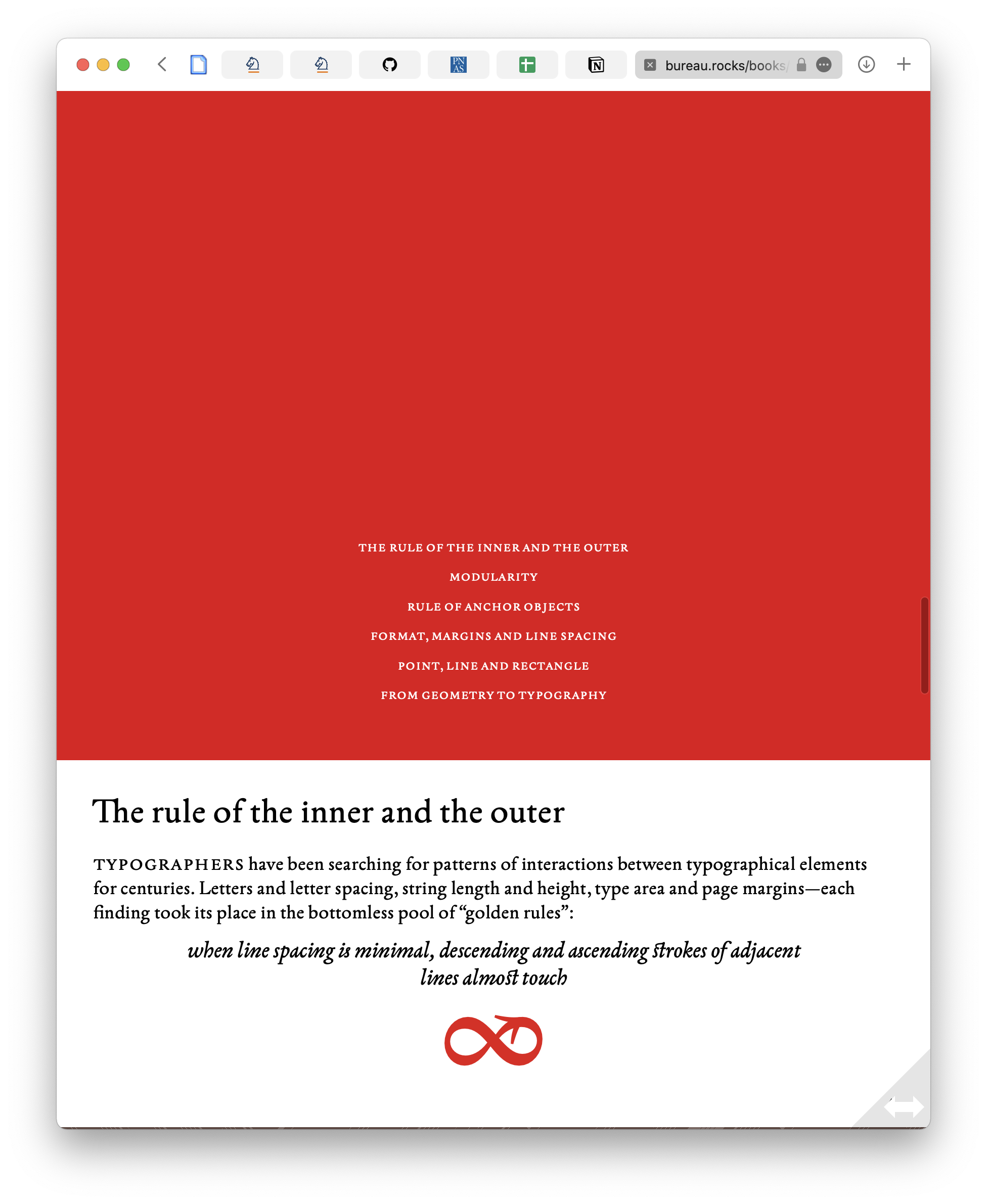
Books are a contiguous sequence of “spreads”.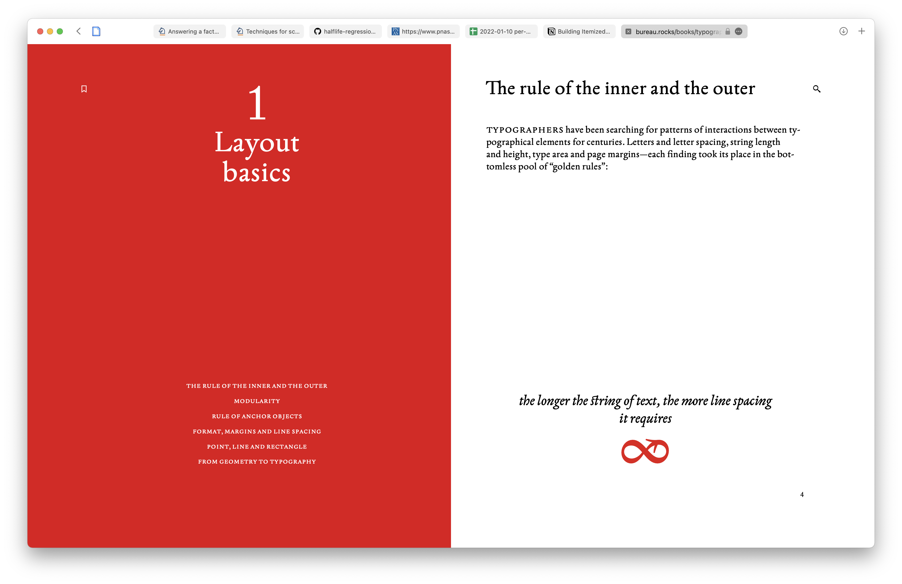
The spreads include some scroll-driven fixed elements:
Screen Recording 2022-01-17 at 4.15.19 PM 2.mov
Each spread has a number of key “stops”, whose definitions vary depending on the spread. In the video example above, each “stop” represents a different key scroll position. The “stops” are represented as a series of circles next to the page number:
Motivation essay
See their essay on their ambitions, “Future of the Book”, by Artem Gorbunov, their art director.
The book is a single object—in a single window
The reader should continously and freely move back and forth through the text. Chapters should not be separated from each other by hyperlinks or other artificial barriers. Returning to the book, the reader should not only continue reading from the same place, but also be able to recall the last few paragraphs, even if they are in the previous chapter. So, the solution is that the digital book should be entirely placed in one window.
People read on the screen, scrolling the text vertically. Web designers have learned to control the corners and sides of the representation by using “sticky” scrolling elements. If desired, any element can be pinned to the top, bottom, any side or corner. Our page spreads work in that manner: an illustration or other object in question can be pinned to the top, sides or bottom.
The book is intended for continuous reading and requires full attention of the reader. Therefore, the spreads of our book entirely occupy the window and the field of vision of the reader. But our page spread is a semantic unit rather than the result of mathematical division of the book into identical “screens.” Text on the spread can be scrolled, when necessary, and the illustrations will retain their position on the screen, or vice versa.
Unlike “sticky” pictures in longreads, our spreads are separated from each other. First, pagination makes it easier to read long text: that is well known for “paper” layout designers. Second, semantic division helps the reader to easily remember the needed place, to return and, of course, refer to it.
Each spread has its unique number and URL, so that the reader could retrieve it from the address bar and use in a hyperlink.