Andyʼs working notes
About these notesMochi
Mochi is a web-based Markdown-centric Note-writing system with an integrated Spaced repetition memory system.
At least in a limited sense, Mochi attempts to deliver on the ideas described in The mnemonic medium can be extended to one’s personal notes: while the primary interaction is card-writing, there’s functionality meant to support writing prose notes with prompts embedded. These behaviors are curiously de-emphasized; I suspect that’s because the application seems to be designed primarily for the use case of language learning.
It’s nicely polished visually, and it’s increasingly complete as a product. The project began in February 2019 and was under vigorous development with regular releases as of May 2021.
Writing cards inline with notes
In earlier versions of Mochi, “notes” and “decks” were treated as separate objects, but it appears that they’ve recently been unified. Now they’re the same thing—it’s just the view mode which distinguishes them.
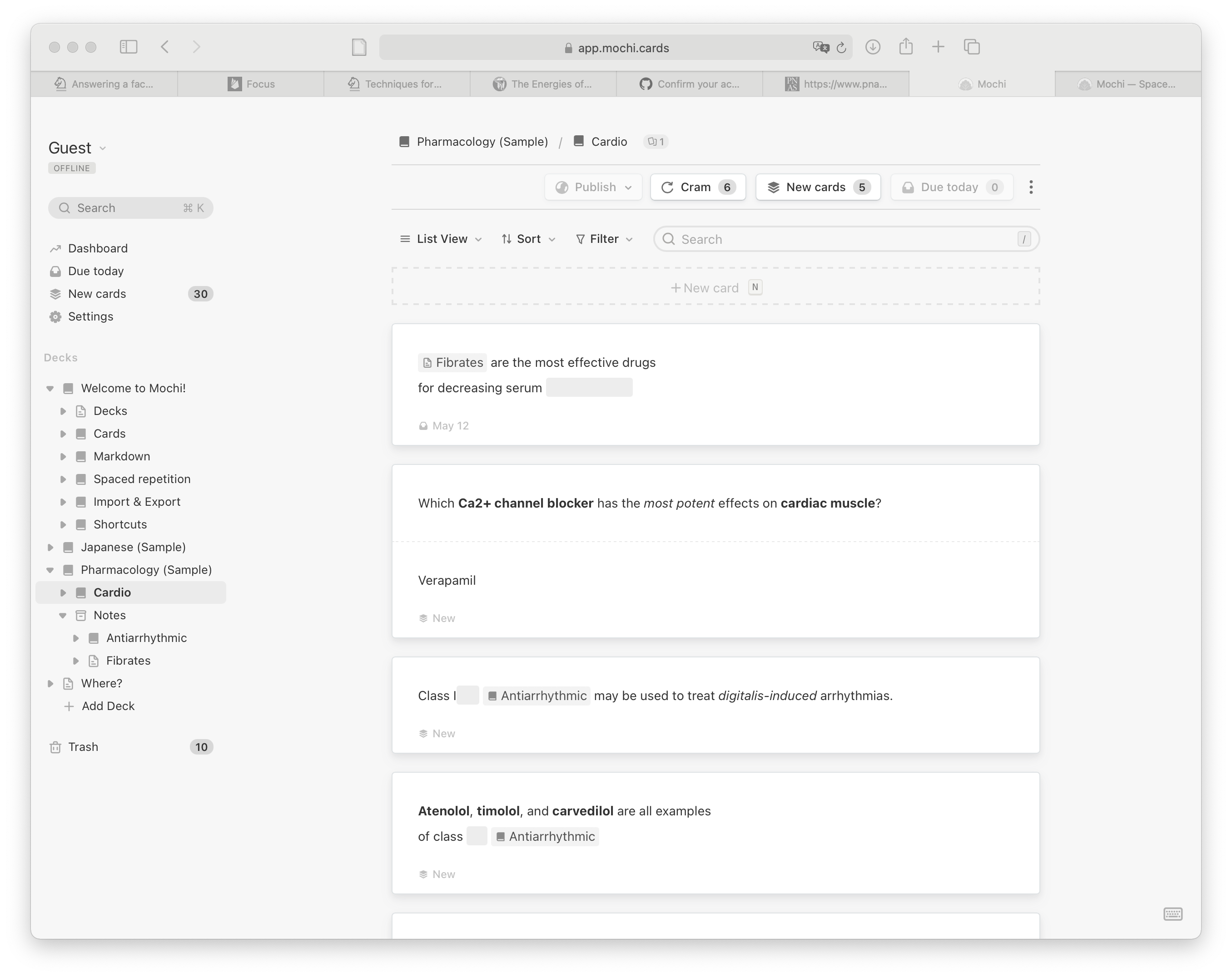
So a given “deck” can be displayed as a list like this:
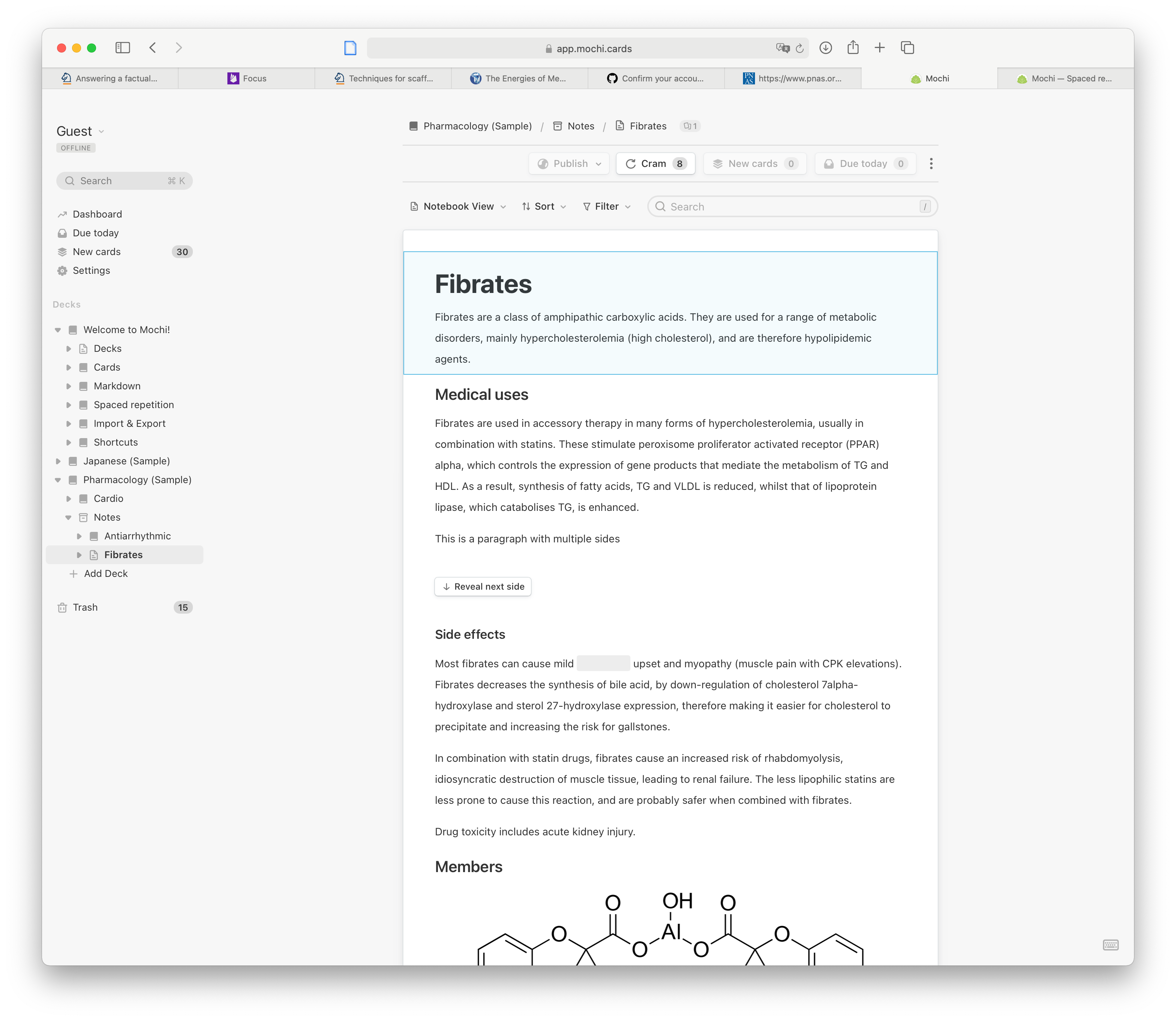
… or as a “notebook”, which flattens the cards into a continuous view:
It doesn’t behave quite as a continuous text editor: each paragraph is a “block,” and you can’t move your cursor between them. But there’s a pretty nice typing interaction:
- Create a new paragraph.
- Type a line or two.
- Type
---. - Type some more text.
- Hit return twice.
- Now you’ve made a card!
Screen Recording 2021-05-11 at 11.04.17 AM 2.mov
In terms of prose editing, the interaction model is pretty awkward: everything works paragraph-by-paragraph; you need to “click in” to open a paragraph and make it editable; then its contents jump around, making it hard to “target.” You can’t move between paragraphs using the cursor or operate on multiple paragraphs at once. But this is a highly tractable model, implementation-wise, so it’s neat to see.
Another key issue with the “personal mnemonic medium” angle in Mochi right now is that if you write a long prose note with a few embedded cloze deletions or multi-sided prompts, the paragraphs are all added as tasks to be reviewed (i.e. as prompts without backs). This strikes me as quite an odd choice!
SRS implementation
Uses a modified SM-2: easing is not dynamically adjusted (though it can be manually set per-deck), and forgetting a card halves the interval instead of resetting it.
There’s a “learning” phase for new cards, like in Anki. “New cards” are treated distinctly from “Due today” in the UI. First, you must answer a new card correctly, then it’s added to your pile due the next day.
Directly-embedded cards
On 2019/11/18, added a feature which permits embedding SRS card UI directly into notes. They have to already exist separately in a deck; the syntax is quite awkward. It’s roughly a transclusion operation.
Business model
The product is free to use as a desktop app. Syncing and API access costs $5/mo. A tough business model: he’d need 1700 active users to hit $100K ARR.
The author is {Matthew Steedman}. New York-based, mostly in agencies (including Code and Theory). Partial BFA in advertising / graphic design.