Andyʼs working notes
About these notesKawara
Kawara is an iOS app created in early 2020 which collects and presents content periodically over time in daily viewing sessions. This is a type of Spaced everything, without any specific engagement actions with the items—you just view a thing and continue to the next thing.
Their one-sentence explanation for press:
Kawara helps alleviate social media burnout and cultivation of healthier habits by providing a daily collection of things you want to remember; people, music, art, anything.
But that’s not at all how Kawara presents itself to consumers: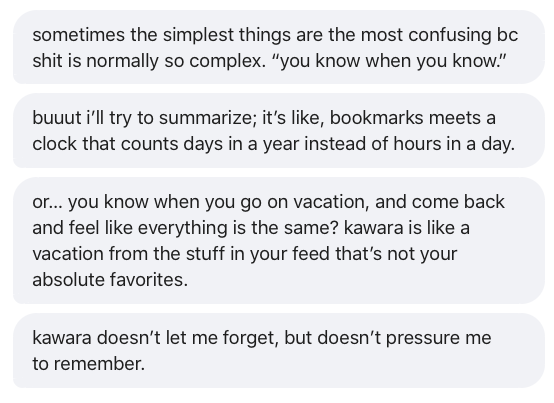
It’s about memory, sort of, but in breezy way: “kawara doesn’t let me {forget}, but doesn’t {pressure} me to {remember}.” See Spaced repetition mechanics create a sense of effortlessness.
It was created by {Jon-Kyle Mohr}, an artist-technologist based in {Los Angeles}. Its business model is a ${2}/month subscription. It appears to be a small side project of the author.
Mechanics
What happens if you skip a day? Do things accumulate, or do they simply get skipped? Not sure.
No “progress mechanics” at all, and no dynamic tuning of the cadence. You’re asked to choose a cadence when adding an item, and that’s that. I feel this is an odd choice: I often have no idea when I first see something how often I’ll want to see it. Being asked to choose feels weighty and unpleasant. I don’t think I’d usually make that choice correctly. And adjusting the interval directly feels awfully fiddly. But maybe this is over-optimization. Maybe a rough instinctual choice of interval is fine, especially for small collections?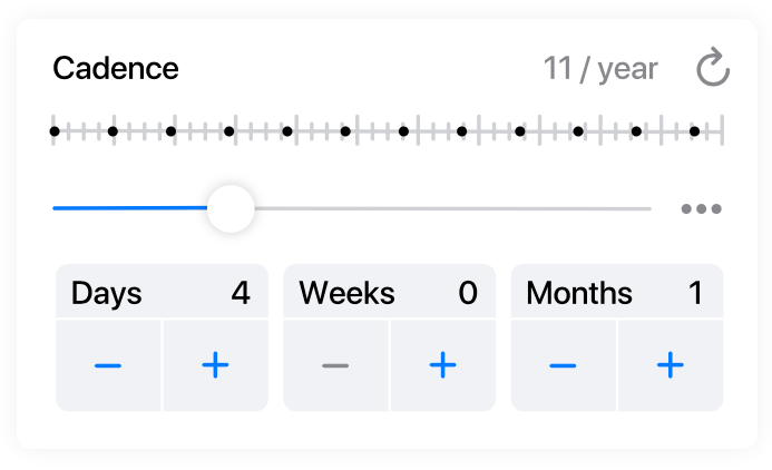
Q. How are item intervals set in Kawara?
A. They’re manually specified by the user at ingestion time.
Presentation
The marketing web site presents the app in a very “millennial” aesthetic. It is sitting in a beach chair, wearing sunglasses and shorts, and it is just slightly stoned. It’s a bit affected for my taste, but it really succeeds in removing this format from Spockian “memory efficiency.” Most of the marketing examples focus on aesthetic material, creative inspiration, etc. Tellingly, it features an are.na integration. It’s not purposeful, it’s for “seeing good stuff.” This is an interesting solution to Current conception of Orbit is overly memory-focused; where’s the poetry?.
The emphasis on coming back to stuff you found interesting, but without any specified form of engagement, is quite similar to Readwise. Readwise’s simple list of highlights didn’t work for me: my eyes scan over it, then I archive the email without really engaging. But maybe visual material’s meaningfully different.
Their product marketing video is a different aesthetic, a bit more Instagram-sunshine-aspirational, but still poetic. The pitch is focused on avoiding procrastination and distraction.
By using intervals to set a cadence, we can keep it a little healthier, and better inhabit the little time we have. Kawara lets you follow anything, anywhere on your own time—from once every few days to every few months. Instead of updating constantly, it provides you with a daily collection and doesn’t update again until tomorrow. All in time: Kawara.
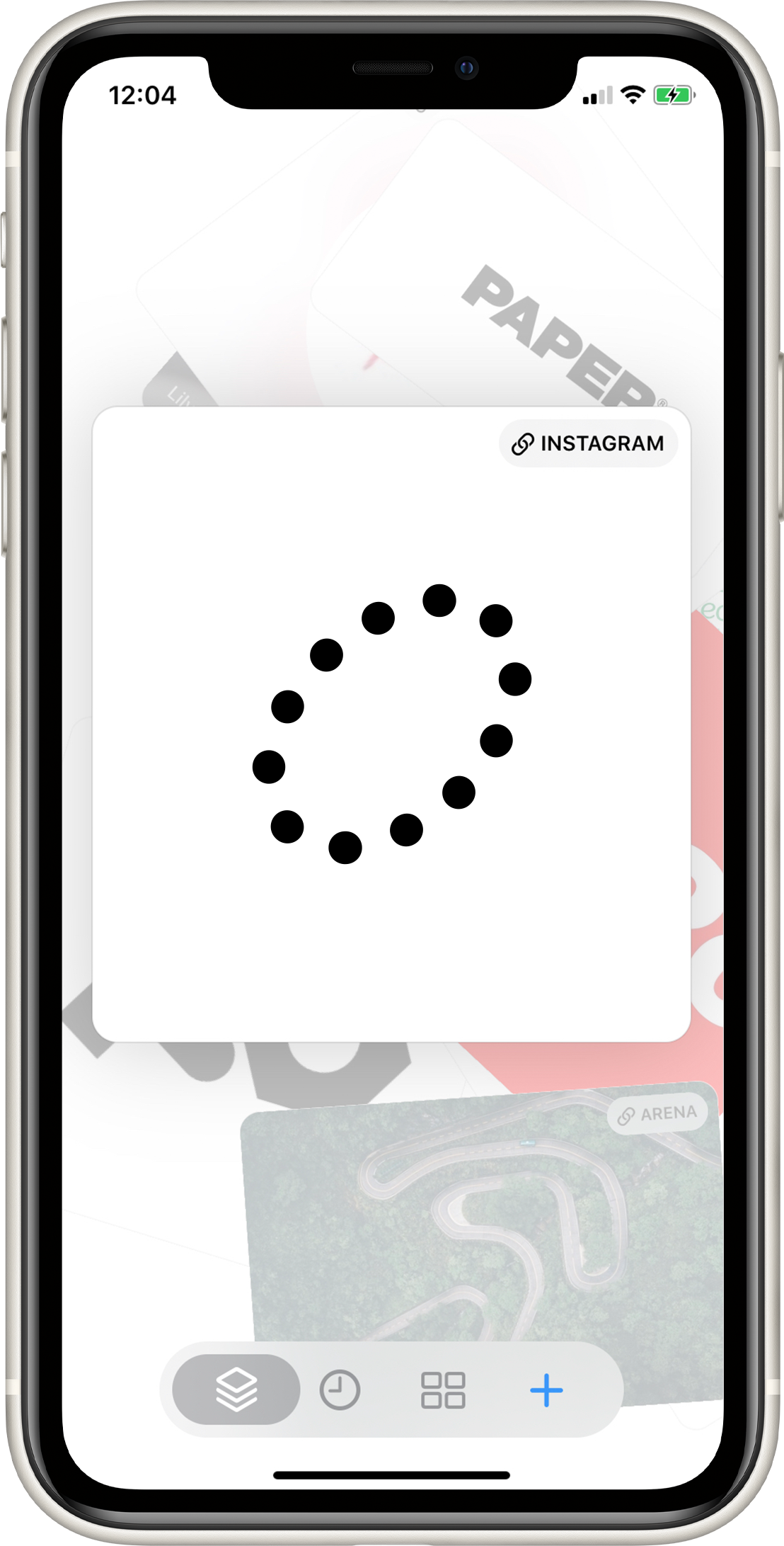
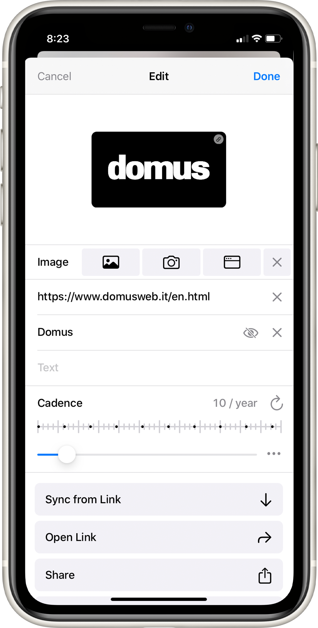
They have a fascinating cadence visualization: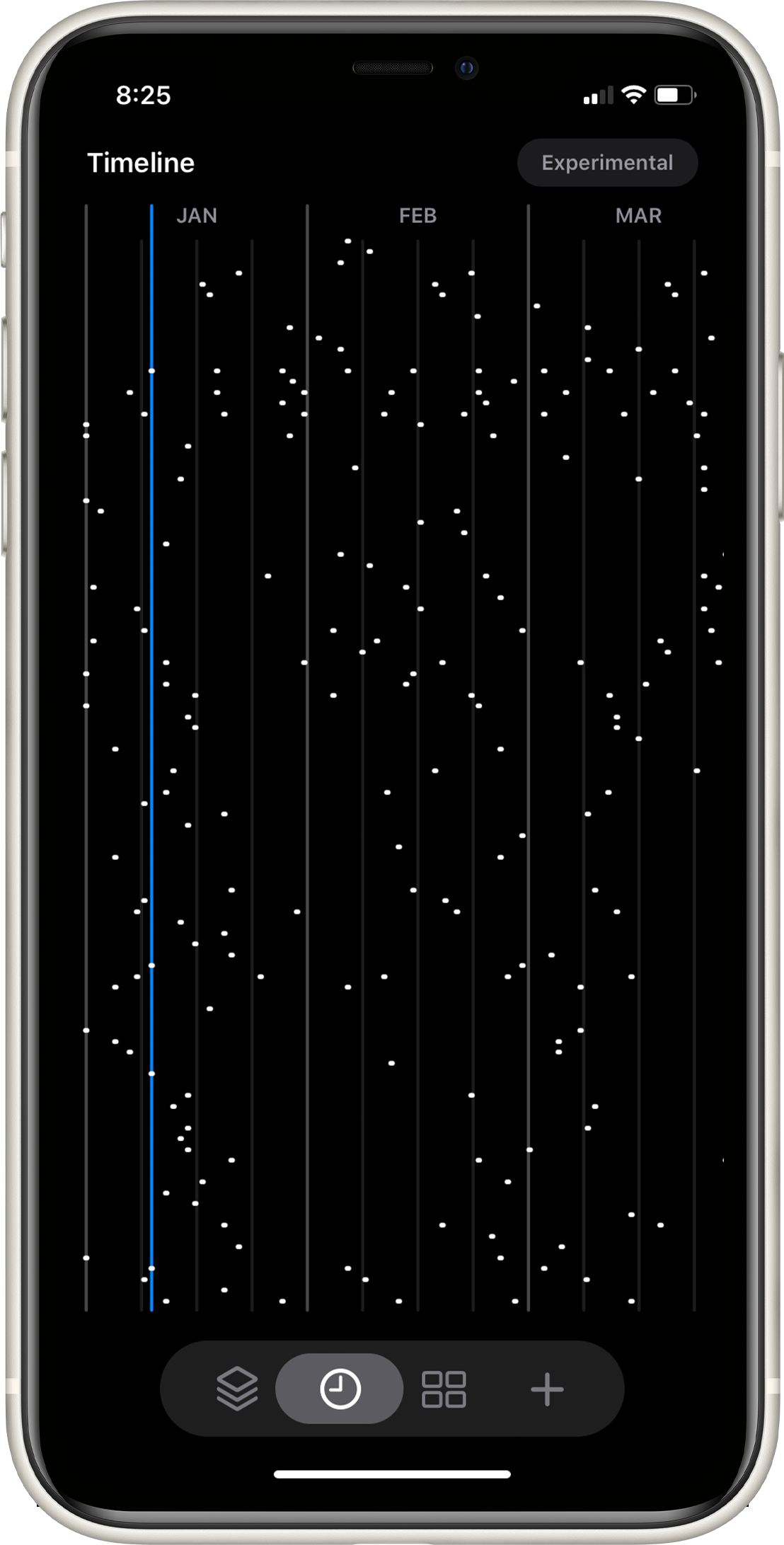
I don’t really know how to parse this, but it’s certainly evocative.
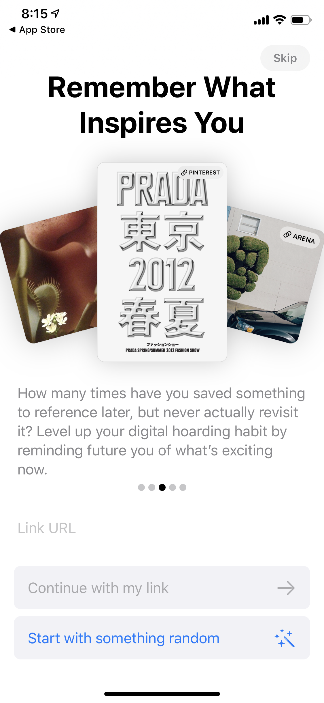
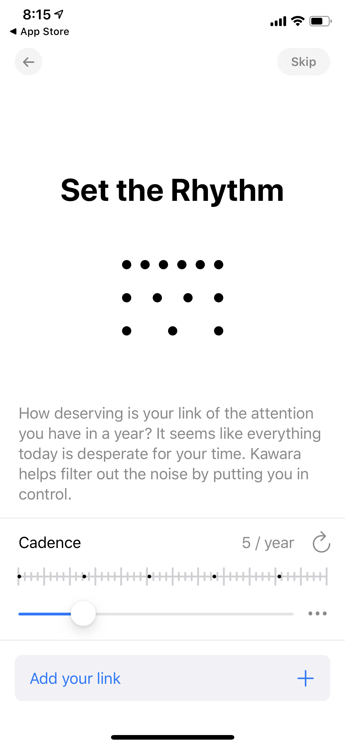
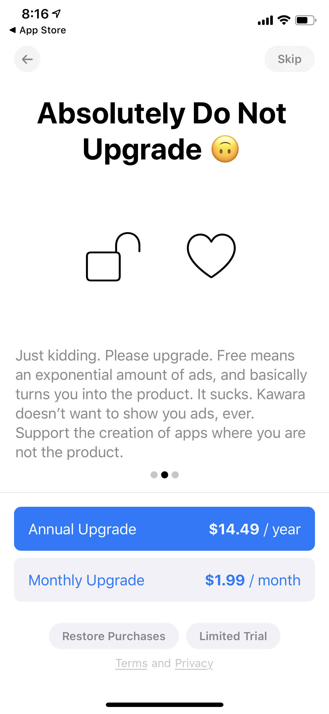
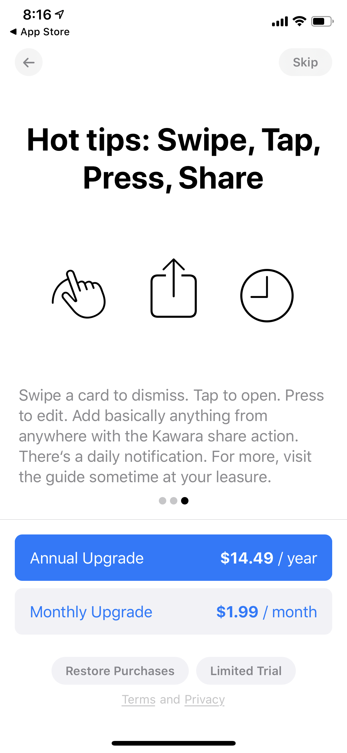
(via Taylor Rogalski, 2020-06-02)
Jon-Kyle earlier made a similar tool called Hardly Everything, which allows you to create a feed by adding a bunch of URLs and specifying their intervals. Via Brian Sholis, 2022-03-03.